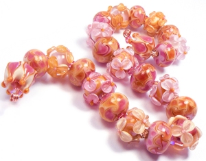
The colors I will be looking at in this post are all transparent pink shades in the medium to very light variations. They are: CiM 915 Pink Champagne, Effetre 067 Rose Quartz, Effetre 082 Lavender Blue (aka Rosatto), Effetre 068 Pink and Effetre 082-A Amber Rose Odd.
 You can see the color differences in this Pink Wheel. While I tried really hard to get the colors right in the image, please note that colors may not appear exact on every monitor. And the palest color, Rose Quartz, appears really washed out here.
 So first, I want to talk about the new Effetre Rose Quartz. This came out a couple of months ago, when Mike Frantz was going to send it back until someone talked him out of it. (Rumor of course!) I think he just thought it was a lighter version of Effetre's regular transparent pink - also shown in the wheel.
 Not true! Rose Quartz and Pink are very different in my view. Effetre 068 Pink is much peachier in comparison. Rose Quartz is a very cool, pale baby pink. I would classify it as a tint - it's so light. The rods look almost clear unless you look at the ends - that's where you see the most color. Rose Quartz has replaced 082 Rosatto for me as a layering pale pink - for one very big reason. More on that later. RQ makes wonderful layering over Rubino and the various shades of opaque pink. I've been using it a lot these past few weeks. It's clarity is nice, it's got a medium amount of stiffness, and it encases well. Plus - it's baby freakin' pink!!
 068 Effetre Pink is the classic oldie of this bunch - it's been around forever. However, I rarely use it these days, because it just isn't pink to me. It's peach - granted, a pale, cool peach. Vetrofond came out with its version of Pink a few years ago, and I liked it because it was slightly less peach. I didn't have any to compare for this post though, because I had been using 082 Rosatto for so long.
 082 Rosatto was my favorite for a long time, when it came to transparent pinks. It's official name, Lavender Blue, is really weird, since it's not blue at all. It does, however, shine a tiny bit lavender-y when under fluorescent lights. This is why I was so happy when Rose Quartz came out.
 But Rosatto is a really pretty color - slightly darker and more lavender than RQ, and great for layering as well. It's perfect for really berry-shaded purples and pinks in layering. But for true pink, I love the RQ.
 I threw Amber Rose into this party just so you could see another medium shade - this one much peachier and warmer than pink. In fact, I wouldn't really call this pink at all - but a dirty pinkish amber color. This color is highly sought after, because of its rarity. It's not made anymore, but if you can find it, it's well worth the money. The color is strikingly strange, and makes really gorgeous organic bead bases. I'm on my last rod, and I have no clue what I am going to do with it. Maybe hoard it forever!
 Last but not least is the brand new CIM color Pink Champagne. Oh, my freaking YUM. This color is the darkest of the bunch, and delightfully weird. I would classify it as a medium orchid pink with lavender undertones. By itself, it makes absolutely stunning spacers. As a layering color, it's perfect! It also makes the most gorgeous floral petals when combined with opaque Dark Raspberry Pink (also a rare odd that I am quickly running out of!).
Pink Champagne reminds me a lot of Rosatto, except darker and more "sparkly". Seriously, CIM's quality is really impressing me. This color of theirs has gorgeous clarity, a nice stiff consistency (but not Lauscha-stiff) and doesn't bubble or scum like most transparents. It is a tiny bit more sensitive to temperature change, and likes a hot flame emvironment, as far as I can see. And the color? Off the charts gorgeous. The 104 coe color line has a distinct lack of medium transparent pinks - and this color goes a long way towards filling that gap.
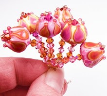
 In this bead I started with Opaque Dark Raspberry Pink, encased it in Pink Champagne, then decorated it with clear scrolls.
So the new pinks - Pink Champagne and Rose Quartz - are right on the money as far as I am concerned. I sure hope both glass manufacturers keep them in the palette!


No comments:
Post a Comment