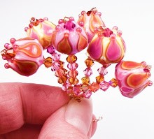
Okay, so I caved. I bought a small assortment of the newest batch of Vetrofond odds. What can I say - I can't stay away from new color, no matter how monotonously orange. I picked this color, Jupiter, to test first because I really think the pic of the paddle is just gorgeous. It's right up my alley with its striations of pale pink and orange.
Okay - now for a dose of reality. This color has virtually no pink in it at all. It's first and foremost a very dark reddish orange. In the center of the rod runs a length of dark colored filigrana that comes out very certainly when you melt the glass into a paddle. You can see it mixed into my swatch above - it seems to be a mix of deep blue-grey and pale ivory.
Working this color is much like any other orange or coral - it has a medium amount of stiffness and a tendency to shock if you're not careful. The rod strikes slightly, allowing the orange/red to come out easily.
The coolest feature of this color is the filigrana - I got it to stripe attractively right on the front of my bead when I pressed it into a lentil. The stripe stayed even after heating and cooling.
I also really like this shade under the small dots of dark lavender - it's a sweet candy color. Jupiter went really well with the dark purple of the flower I added to the bead.
Jupiter overall is an attractive color if you like deep oranges - it's vivid and hot with a dash of earthy striation. Not bad for an odd!


No comments:
Post a Comment