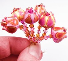
 1. A deep, non-reactive opaque magenta. I realize glass makers may not be able to get this saturated, but anything approaching this delicious color would be hugely appreciated. The closest they have gotten thus far are greyed out purples.
  2. A dense, non-reactive vivid opaque purple. Same goes for this color when it comes to saturation. The closest they have ever gotten to a nice, rich purple is the scary Evil Devitrifying Purple, which is...well... scary. I would like one that is bluer than that, and which does not produce the chalky devitrification, especially when encased.
  3. A sweet, dense, opaque watermelon. Something medium in hue, and somewhere between coral and pink. Maybe this would be the true coral shade that does not turn orange or grey. Again, non-reactive.
 4. A true medium transparent barbie pink. Glass makers have been great at producing lighter, more saturated pinks this past year or two, but they have not been able to get a shade that's truely medium pink. The best way to get this pink is still to layer Rubino with different opaques and transparents.
 5. Deep, rich, opaque chocolate brown. The browns in the 104 coe palette either have way too much red in them, or they are striking colors which can react or grey out, such as Lauscha Cocoa. We need a decent true brown that's nice and vivid.
 6. Anything remotely close to an opaque medium to dark pink. Now, there's lots of glass out there *named* dark pink. But it's just not dark enough. most of the pink opaque shades are very light. We do have the odd lots of 256 Dark Pink Effetre, but they are all very light. I would love a darker, more saturated version.
 7. A subtle dark transparent tobacco that is stable. The closest we have is Czech Lt. Smoke Topaz which is quite unstable and has cracking issues when paired with other glass, and is even really hard to find.
 8. A subtle dark transparent khaki. This would be a fantastic neutral to introduce to the 104 coe line - it goes with everything. We have lighter versions - olive greens and kelp shades, but I would like a really dark one.
 9. A vivid transparent capri blue. Think Swarovski for this color - they have a wonderful bicone crystal bead in this shade that I have never been able to match with glass. An intense transparent of this shade would just be blissful.
 10. A soft, sweet opaque peach - one that does not react, and is saturated enough to stand on its own as a base. We have lots of fleshtones in the 104 coe line, but nothing saturated enough to be called peach - I would like this spring peach very much.
Give me any one of these shades this year and I will be a very happy beadmaker. :)
I think the best chance we have of seeing new, pure glass colors (ones that aren't silver based or reactive odd lots) would be from Creation is Messy. They've been wonderful about listening to us beadmakers about what we would like to see. They even have a place where we can suggest colors for them to try and make. I wish Effetre or Vetrofond had that!


No comments:
Post a Comment