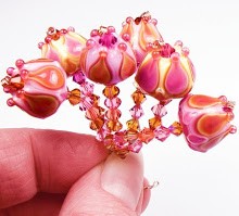
For me, there's nothing like a colorful fashion magazine to get my creative juices flowing, and the April 2009 issue of InStyle certainly does not disappoint! I picked this up at the store because it leaped off the shelf screaming at me - it's "The Color Issue"! Yey! A whole issue devoted to color and fashion. Even the ads are gorgeous.
In fact, I think many of the ads even outshine the articles when it comes to color schemes and visual creativity. Whoever's designing some of these ads is a genius.
There do seem to be some recurring color themes throughout the issue. For the most part, the colors are either incredibly bright and saturated - like the colors of the rainbow, but even more so, or they are muted and subtle. Some of the little blurbs have clothes or items laid out in rainbow order, and they are bright, vivid and almost jarring. Other articles show the subdued but not quite pastel colors of spring. And there's lots and lots of grey! I'm excited about the grey because I love mixing grey glass with other colors.

For instance, check out this blend from a Chevy ad whose tagline is "cargo couture". It makes perfect sense. The car in the ad is silver, and the rest of the page is a lovely shade of grey/berry that just is lovely. Grey/silver and shades of purple are sprinkled over many pages of this issue, so I detect a trend here for the coming season, which I might duplicate in beads soon!
Purple and lavender, along with violet are all really popular in this issue - and pairing them with reds, fuchsias and black is all over the place.

This Mac ad scheme is shown in an ad with a woman wearing a stunning dress of feathers. The effect is so pretty, I almost want to frame it. There's a darker version of this vivid scheme in a Coffeemate ad towards the end of the issue.

Throw in some deep red and chocolate brown with the purple and a bit of tuxedo black and white and you get this delicious scheme, shown in a dress ad by Badgley Mischka.

I think my favorite ad of the bunch is this two-pager by Got2Be hair products. The picture is lush and opulent. I'd buy these without caring what they contain, just to have the bottles, which are a sweet combination of berry and creme brulee that kills me dead. If I can figure out which glass colors will give me this combination, beads will definitely be made.

Some of the ads and articles featured colors that I never would have put together on my own - like this one, shown in a shoe ad from Privo by Clarks. The black/maroon and grey/camel shoes are floating on a sea of greyish aqua blue that I can't even think of a good name for! The effect is lovely and soothing. And totally makes me want to buy the shoes.

Another totally unexpected delight is the ad by Dexter and Payless Shoes, which features a girl in a bright yellow sweater lounging on a grey/blue/aqua sofa chair thing. Her shoes are cute, but I don't care, because they are totally outshined by the black/yellow/blue of the ad. This weird shade of grey/blue/green is in quite a few places. I just wish I could think of a name for it.

A more subtle version of this color pops up again near the end of the issue, in the feature article section. Stones, greys, peaches and this lovely blueish whatever look so pretty together in the "Pastel Done Pretty" pages.
Another highly popular color this season is green - of all shades, it seems. Whether paired with grey or popping with lime and orange, it's everywhere.

I love, love, LOVE this version of subtle green that tends to show up everywhere - it looks gorgeous with the silver metallic accents in this issues "Spring Trends" section, and even alone with creamy whites and lighter mints in the Macy's "showered ever after" ad.

A brighter version of lovely spring green shows up with yellow in a pretty ad by XOXO. The dress is just stunning - like a flower.

Here it is again with oranges and yellows on a perfect silvery grey background in a Clorox ad, all paper flowers. Bliss.
There's so much more color in this magazine that I didn't show - you should pick up an issue. I'll have bead color ideas for months!!


Quite inspiring! I should pick up a fashion magazine sometime apparently. I'm much more likely to pick up a magazine on home design or decorating than fashion.
ReplyDeleteI have that magazine and was struck by a lot of the same things you were. I opened it up and some of the ads just made me think, 'Oh, what a gorgeous bead that would make!'
ReplyDeleteLove the mag! I agree,fashion magazines are a super source of great inspiration.
ReplyDeleteSounds like a keeper. I will have to pick it up. Thanks for sharing your insight on the color combinations.
ReplyDeletedo they use that season's color picks? I would think so... And you always see sweaters, etc. laid out in a rainbow design!
ReplyDeletethis post is very inspiring!
ReplyDeleteAwesome! I'll have to pick up a copy of this, sounds like there's definitely some great ideas.
ReplyDeleteVery clever of you to dissect this for us. Thanks a million!
ReplyDelete