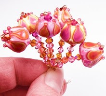
 Before I get into the nitty-gritty about this lovely new color, I want to mention a couple things about some small changes over at Creation is Messy. As stated on their website and in their latest newsetters, CiM has changed the way they label their newer colors. Instead of the "Unique" label, they are now using "Ltd Run" for odd lots and colors they may not make again. I think this helps with some of the confusion around the term "unique", and lets us know that the color being sold is probably going to be limited or might change with each batch. CiM's FAQ page has more information about why they have re-branded their color and how that might effect suppliers.
 Now for the fun stuff!
People who know me and my work may have noticed that yellow is one of the colors I use the least in my beads. And when I say yellow, I don't mean the buttercream shades I use (like Opal Yellow). I mean actual yellow - the primary shade and it's derivatives.
Once in a great while I get a hankering for yellow beads. Good timing, because CiM just released several new shades of yellow. The one I decided to test first is called Marigold.
 In my opinion, a prettier yellow does not exist in the whole 104 coe lineup. In my opinion, yellow is one of those colors that is a bit overlooked and under-represented in soft glass. Unlike orange which is all over the freaking place. I'm not sure why that is, except perhaps that a lot of people don't really get all that excited over yellow.
Personally, I find that most of the opaque yellows in the soft glass line are streaky and somewhat tempermental. The exception to this was 412 Dark Yellow many years ago. It seems to have changed over time, though.
Marigold is different. Like many of the CiM colors I have tested, this opaque shade is very stable.
Marigold is not too stiff, not too soupy when melting. It melts very evenly and has a really nice consistency. I didn't notice any bubbling or shocking when melting on my Minor Burner. Like most yellows, Marigold turns a pretty shade of orange when heated, but gradually cools back into its original shade.
One really wonderful thing about Marigold is that it does not lighten when encased or pulled into stringer. It's a very vibrant, saturated autumn yellow that fits the name of the glass perfectly. Even thinly applied dots retain their vibrance.
Marigold also doesn't seem to spread out, bleed or overtake any color it's paired with. It encases easily and layers like a dream.
In these beads, Marigold is layered with clear (DH Aether) and paired up with Effetre 247 Pastel Ink Blue and Effetre Rosatta. Plain, shiny black (Vetrofond) makes the colors pop.
Now I'm itching to make pumpkin beads and maybe even squash beads with this color for fall. :)


Evidently CiM classifies Marigold as an orange and not a yellow....but I think it is most definitely more of a yellow. It's not pastel or spring-like, for sure, but still an autumn yellow, in my opinion. :)
ReplyDeleteI really enjoy reading your color blogs! They have been extremely helpful for me. Thank you so much for doing this!
ReplyDeletelovely..not a yellow girl usually, but when you pair it with others it really does add a spark. Love these..wow.
ReplyDelete~Deborah
Thanks for the blog. Going to order some!
ReplyDeleteI LOVE yellow, so I'm looking forward to working with some of this.
ReplyDeleteThanks you guys - glad you like the post! :)
ReplyDeleteI LOVE this yellow (and your test beads)! Thanks so much for this post. I can't tell you how many "bad" yellows I've wasted my money on, just looking for one like this.
ReplyDeleteYellow is not my favorite either Kandice, but you make it beautiful. Would you believe at the last two shows I had two people ask for bright yellow items. Sheesh. I have all blues and purples and greens.
ReplyDeleteLove your color posts Kandice, glad to see more.