 Let me just preface this post by saying AAAARGH! I have never had a tougher time photographing a color scheme. My camera hated these colors, so I imagine they might look slightly different on your monitor that they do in life. However, know that I tried very hard to get these to look right, I promise.
 All three of these colors are very pretty in reality - maybe better than what you can see in the pics. Maybe I need a new photography set up!
An observation: Creation is Messy seems to like making green. They have a lot of shades of green. All of them are different - and if you count the limited runs and discontinued shades, you have quite the selection. I imagine its because they are constantly trying new formulas and end up with a lot of colors they can't recreate. Personally, I really love this. It means we will never have to worry about not having the right green! Now, if they would only do this with pinks, I would be even happier. :)
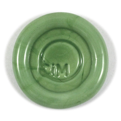
 First, we have the opaque color - Iguana. This is the color that
  |
| CiM's pic of Iguana. What the...? |
*Note - after seeing my post, Kathy at CiM says she will likely re-take the picture of the Iguana paddle above to reflect a more accurate color. :)*

Iguana behaves like most other greens in CiM's line. Better behaved than Effetre's opaque greens - but still does striate, bleed and feather just a tiny bit. If you're careful not to overheat it, it can be a great layering color - especially with the lighter transparents. Just make sure it's completely covered with any encasing that you do or it might bleed a little out from under the clear or transparent color.
Iguana has a decent amount of density, and does not fade under layers. It retains its bright color even under a thick layer of clear. It works very nicely - not too stiff and not too soft. When used as a base, I was able to melt in decoration without much trouble or reaction, other than the slight striating lines that most greens have.
I really like this shade of green - I just wished it photographed better. I really had to finesse the color out with my editing software, and even that didn't come out exactly right. You might just have to try it for yourself to see its full beauty! Iguana will be available in June.
 Next we have the transparent Green Tea - which pairs perfectly with Iguana. At first, I thought this color might be a dead ringer for Appletini. However, Green Tea is slightly more saturated than Appletini. I would maybe compare it to Effetre Pale Emerald, but more saturated and a little more yellow.
 Again, my camera had a hard time picking up the intensity of this color. I had to edit the crap out of it, and it's still not quite right.
If you are familiar with Swarovski, this color matches their Peridot pretty much right on. This makes Green Tea a great addition to the palette, because in my experience, all other light greens are just slightly off from Peridot. I love that this matches right on, because Peridot is one of my very favorite Swarovski colors.
Green Tea is an easy color to use. No reactions, a decent stiffness, without being too stiff, and not much bubbling or scumming at all. Its only problem seems to be that it hates being photographed. At least by me. :)
I loved using this as the companion to Iguana - the pair makes a gorgeous spring green that makes me think of freshly cut flowers and sunny days. Available in June.

 The next color - Mediterranean - is one of my new CiM favorites - which is no surprise, given that it is a lighter version (to me anyway) of my favorite CiM color - Leaky Pen. Mediterranean is described on CiM's website as a transparent denim blue. For me, it's really more of a teal blue. Denim in reality has more blue and less green than this color. But that's just me being picky.
*Note: after seeing this post, Kathy at CiM changed their description of this color to teal blue instead of denim. So nice!*
Mediterranean is a very similar shade to Leaky Pen - just a lighter version. That makes it nicer for layering, and brings out the beauty of the color. You can use this color as a thicker decoration - but it's still a little too dark to be used as a base alone, without encasing it.
 It is somewhat stiff - not as bad as some dark transparents, but enough to make working it somewhat of a challenge. I was able to manipulate it, though - it just takes a little extra time.
In these beads, Mediterranean is layered with Vetrofind Pajama Blue - a very subtle pale aqua. I am not sure this color can be found anymore, but you can use any of the other aqua opaques that are out there just as well.
I didn't have any trouble with scumming and bubbling in this glass, but it does need slightly more heat to melt fast. Use care when layering - balance the heat so your opaque doesn't melt too quickly and overtake the Mediterranean.
Mediterranean makes gorgeous encased stringer - lighter than Leaky Pen, but so pretty when used over a pale aqua. Yum! It's available now - I got mine from Frantz Art Glass.
The clear used in these beads is Double Helix Aether. I did have one bead crack, but I think it was more user error than anything else - but I wanted to mention it just in case.
One last note - I went ahead and sold my soul to the devil.....uh, I mean....joined Pinterest. Come on over to see what I am pinning. Goddess help me. :D
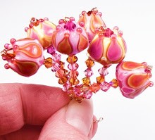
The beads shown in this post are called Seattle Spring, and are available for purchase in my Etsy store.


I love your posts... I have not made any beads in about a year and you are inspiring me to start up again....I wish you taught classes :)
ReplyDelete