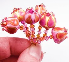
 Lots of reds and neutrals were in the latest batch of test glass from CiM last month - which I really like. Today, I'm talking about Mahogany, a limited run color that is an unusual shade of reddish brown.
  I couldn't quite figure out what this color was supposed to be when I saw the rods - it was a shade or two lighter than Effetre's old Cinnamon Chocolotta, and was labelled an opaque red on CiM's website.
For me, the name is kind of confusing. When I think of mahogany, I think of the wood - a rich, dark reddish brown. This color is more like cinnabar, or even a brick color, but not as orange. It sits right between red and brown for me, making it difficult to classify. Whatever we try and call it, it is a color we don't otherwise see in the 104 COE lines, which is great.
Mahogany is a nice fall shade - it goes really well with the ambers and browns of the season, and fits right in.
 I love the density of this glass - it's well saturated, so it doesn't wash out or go translucent under encasing. Layering is easy - it stays opaque. The glass itself isn't too stiff or too soft, and didn't have any shocking problems.
Mahogany does have a tendency to striate - and strikes just a little. You'll get little reddish streaks if you work the glass for awhile. Under clear, the color goes more brownish than red, especially if it's not melted in.
It encases like a dream, and doesn't bleed or spread much at all. The glass is stable and the color stays put, even when used as encased stringer.
In these sets, I paired mahogany with Effetre Opal Yellow, Medium Topaz, Light Topaz and Black. Clear was used for any encasing or layering over the Mahogany.
All in all, I really like this addition to the color palette. Nice and spicy for fall!


No comments:
Post a Comment