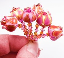
 Happy weekend, everyone! Next on the docket we have two new CiM colors that I really loved.
 First up is Lilac, a pale opaque lavender-pink. When I saw these rods I have to admit I wasn't all that impressed. After all, we have lots and lots of too-pale pinks and lavenders in the color palette, and one more wasn't going to do much for me. This is for two reasons - one is that most of these pale colors are just too pale for me when worked alone - especially when you don't layer them. Second is that the majority of the really pale pinks and lavenders are not as opaque as I need them to be - they're opalescent, which makes them hard to layer because they don't keep what little color they do have.
If it sounds like I'm picky - well, I am. Pinks and purples are tough cookies in the glass world!
 Lilac is very, very pale - almost icy - and not really pink or lavender, but somewhere in between. However, it makes up for those things by being quite opaque and just a dream to melt. It's not as stiff as more opal glass, and doesn't lost it's opacity when layered. That means you can put darker transparent colors over it and it won't wash out or go see-through. When encasing it in clear, it does go lighter, as you might expect.
 So for me, Lilac is a perfect color to layer with things like Rubino, Double Helix Rhea (as seen here), transparent Dark Violet and other saturated pinks and purples. Lilac holds its cool, icy tone well, shifting the reddish fuchsia in the Rhea to a colder hot pink fuchsia - perfect!
Lilac melts really nicely - I didn't have any shocking, which is a relief, since lots of glass seems shocky these days. There also wasn't any pitting or spreading or bleeding - just nice, smooth, opaque, pale color. The viscosity is pretty nice - not too soupy or too stiff.
Tiny little purple striations appeared in the pulled sampler of this color, but no striations appeared in the spacers or in the beads where the color is left bare. I imagine that using this color for sculptural work will lead to some striations.
(Below: Lilac is covered in Rhea on these beads - you can see that it holds its opacity well, even in the encased stringer.)
Next we have Serenity - a medium transparent teal. Now, CiM has done a lot of batches of transparent glass in the blue-green spectrum. Like, a lot. But I'm not mad at that. I love the variety of color. This particular shade sits right in the middle - it's bluer than both Aegean and Poolside, and greener than Zoe, Pulsar, Blue-yah! and Birthstone. It's medium in saturation, making it a lovely color to layer - my favorite thing to do!
There's not much to say about the workability of Serenity - I experienced no bubbles or scum (a nice departure from most transparent blues and greens), no shocking, no spreading or bleeding and no pitting. It's not too stiff, and doesn't seem to react to much - it's just your basic, easy glass.
In these beads, I layered it on top of Fremen, which is a light sky blue. I thought the outcome would be lighter, but I was pleasantly surprised at the lovely, vibrant shade of turquoise-teal that I got.
Serenity fits right into its own spot in the kind of crowded palette of blue-greens, but for me - the more the merrier, because I adore these colors!
**One note on the photography - the lighter the color, the tougher it was to photograph, and Lilac was one of those colors that my camera just hated. Also, Serenity appears slightly washed out to me on camera - but all blue-greens do to me. They never, ever look the same in real life as they do on the screen - even in anyone else's pics. What I see is always more brilliant and multi-dimensional in real life than in a picture. My husband and I both think I can see these colors differently than other people, so I try to get the pics to be as close to what I think everyone else sees as I can. It's possible that I am a tetrachromat, but who really knows. Please do let me know if my pics ever seem way off - thanks!
(Below: Serenity is layered over Fremen, yielding a gorgeous turquoise)
More to come!


Thank You for doing these tests, I really enjoy seeing them pop up in my feeds.
ReplyDeleteRuth H