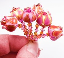
So Vetrofond, our favorite Odd Lot glass maker, has come out with yet another huge assortment of weird colors for us to try out. This is what...the fifth batch? I do applaud them for listening to their customers and for really trying to put out new and inventive glass for us.
But enough with the orange filigrana, please!! :D I mean, have you SEEN the latest batch of odds? Almost all oranges and greens. And ALL filigrana - a dark color covered in a contrasting lighter color, for a marbled look.
I say that with love and hope that Vetrofond will soon hear me and come out with some great new opaque purples and pinks. Actual pinks. Not faded out pale translucent pinks. Stellar purples. Not greyed out, reactive purples.
It's true that Vetrofond is likely catering to those beadmakers who really love reactive glass - who adore making organic beads and messing with different metallic reactions. I guess I am just one of those rare glass-lovers that love plain, pure, stable colors that I can combine and layer without reactions.
Don't get me wrong - I do love reactions, sometimes. But not with every color.
We have enough of those now, I think. Double Helix, Vetrofond, ASK, Lauscha and other makers are really pumping out the silver based, filigrana, reactive, organic and weird. It's fun to experiment with them - to a point.
One other thing - if you've been buying all this new glass, you've probably realized by now that the paddle pics shown on the vendors web sites do not often relate to the real thing when you personally melt the glass. I've still not been able to get that sweet marbly pink and cream from Sweet Strawberry. Just a rusty, tomato red. Pink #3 Pastel was nothing but almost white for me. Orange Punch never looked like the paddle pic - it stayed a translucent red, no matter what I did. And the gorgeous Poppy? Hard to turn pink, like the paddle - mostly a luscious.....yep, you guessed it......orange. I am afraid to buy the brand new Jupiter - it looks so yummy in the paddle, but who knows if I will actually get that color for reals.
So.... Vetrofond? Please? A deep, vivid opaque purple. A bright opaque pink. A sweet opaque apricot or peach. Pretty please. And no more orange. For the love of GOD no more orange.
Kids Activities Using Real Flowers
8 hours ago


No comments:
Post a Comment