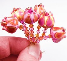
 I finally got my butt back on the torch the other day, and let me say - it was so much fun! There's just something that happens to me when I pick out just the right glass colors to melt and layer together.
 I've done greens with purples many times before, but I have never combined these particular shades. The glass colors I used on this set are from CiM (Heffalump and Dirty Martini), Effetre (Dark Lavender, Dark Violet Transparent, Yellow Green and Sage Green Transparent) and Precision (Diamond Clear).
 Oh, magic! Usually, instead of the minty freshness of Dirty Martini, I use the reactive Copper Green. Using DM gave a cleaner, crisper finish to the mint green opaque base on these beads, without the tendency to patina with copper that Copper Green has. And the opacity was dense and smooth. (Opacity? Is that a word? Opaqueness?)
 Heffalump, Cim's lavender opaque glass, replaced my usual Effetre Pale Lavender. Heffalump is more vivid and has less of a tendency to fade than PL, and just glows under lights.
  I normally use a lighter shade than Effetre's Dark Violet Transparent (like, say, Ink Blue Violet), but with the Heffalump, it just sings. It's so deep I had to really layer it thinly, but encasing it with the Dark Lavender Effetre really helped bring out the color.
 Yum. I am really happy with this set. So happy that I couldn't break it up into smaller bites like I usually do to list them on Etsy. This time I just lumped them all together and put them up on ebay - something I haven't done in months. There are more pics at the auction, so have a look!


Purple and green is one of my favorite color combinations... you have done just a beautiful job :) I envy your talent!
ReplyDeleteRenee :)
Wow these are spectacular. I love green and purple together. Fantastic job.
ReplyDeleteOoooh these are abolutely beautiful Kandice.
ReplyDeleteWow, these are spectacular! I love the color combination, and the patterns you did with each bead!
ReplyDeleteGreat job!
These are stunning!
ReplyDeleteLovely color combo...I always like those two colors together.
ReplyDeleteThey are gorgeous! Just goes to show that when you step outside of your normal habits to experiment, it pays off one way or another! Lovely!
ReplyDeleteBeautiful as always Kandice...but really, no more butts on the torch~ that's just too painful.....sorry, no one else did..I HAD to! :D
ReplyDeleteThose are absolutely gorgeous! Love those colors together.
ReplyDeleteHi Kandice, I have just nominated you for a Kreativ award. Your blog posts on colour and the many different glasses is an invaluable read for people in glass bead making. Thank you, details about the award are on my blog!
ReplyDeleteSam
Thank you everyone! I really appreciate the kind words. :) And thanks for the award, Saffie!
ReplyDeleteWhat a stunning set! Those colors work together perfectly!
ReplyDeletei love these colors!
ReplyDeleteSimply gorgeous... also my son's favorite colors!
ReplyDeleteAwesome job!
ReplyDeleteI am in LOVE...... with your creativity!!
ReplyDeleteGosh..they are beautifulllll.....thnks for sharing...
Oh, my! Absolutely beautiful!
ReplyDeleteThese are gorgeous! I wish I was crafty and could order them to make something with! They make me drool....
ReplyDeleteWow!!!!!!
ReplyDeleteTwo of my favorite colors together in gorgeous patterns.
Oh my!! These are heavenly! I KNEW I should have stuck with the lampworking. sigh.
ReplyDeleteThese are absolutely gorgeous! I don't understand the technical part, but i worked!
ReplyDeleteYou have been nominated!
ReplyDeleteStunning colors together! Love the designs on them too.
ReplyDeleteWhat a beautiful color combination!
ReplyDeletepretty, pretty colors
ReplyDeleteThese are absolutely beautiful!
ReplyDeleteThese are utterly beautiful!
ReplyDeleteWoW what great work!
ReplyDeleteI have always loved purple and green...but what about clear vibrant tanzanite (blue-violet) and kiwi green (green-yellow)! Those 2 colors just make my heart sing!
ReplyDeleteThank you, thank you!! :D
ReplyDelete