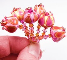
I haven't torched in two weeks. I've been either sick or traveling to family events, so my poor studio has been sorely neglected.
However, I am feeling better now and am just chomping at the bit to melt more glass.
I just got some more stuff from CiM to test and write about, so I will be working on that in the coming weeks, along with more testing for Frantz. Before I get to that, though, I have a couple of random stuff to talk about.
First off, I was saddened to find out that the CiM color Tamarind is no longer available in its original form. I wrote about that gorgeous caramel brown last month. I LOVE that color. I have no idea why it's not being made anymore, but I plan to ask CiM the next time I email them.
Currently, you can get something called CiM Tamarind Unique, which looks to be much lighter and more of a putty color. Since CiM already has several similar shades like this (such as khaki, stone ground, and others) I am unsure as to why they are selling this version of Tamarind. Maybe it's a fluke - who knows. But I will be finding out - and I will try my best to talk them into offering Tamarind in its original form. There's no other color even close to the original in any other brand, so hopefully CiM will follow my advice. (oh, please, oh, please!)
CiM's latest colors that I got in my test packet look really interesting. However, only one of them is opaque (called Mermaid, which looks really promising), and two of them seem more translucent or opal (called Poison Apple and Mink).
I may be in the minority here, but I am really not enthusiastic about all the semi-transparent colors that have been coming out lately from CiM and others. Colors that are neither transparent or really opaque are all but useless for me. As pretty as they are, I can only really use them for spacers. They don't layer well and tend to be persnickity in the kiln (meaning they can sometimes crack if you don't follow a specified kiln program that may or may not work with the rest of your regular 104 COE glass).
I know a lot of people use these opal colors for their bases - My friend Kim Affleck does this really well. However, I work very small and just don't like using these colors as a base. It's just personal preference, I guess. So if you see me review these opal colors with less of a positive attitude, that's why. It's not that these colors aren't perfectly fine in general. It's more that I don't see them working for me specifically.
Here's what I look for in glass for my own particular tastes:
For opaque colors, I like them to be very dense (no tendency to turn translucent at all) so that I can layer them.
For transparent colors, I like lots of clarity (no tendency to cloud up or opacify, even if it's a striking color) again for layering.
Lack of reduction effects unless I am specifically looking for a particular kind of reduction - such as with DH Aurae and its silver reflective coating.
Lack of reaction - I prefer a stable glass that doesn't react to other glass unless I am looking for a particular effect (such as Rubino's spreading or Ivory's feathering)
True color - glass that stays close to the color as the rod even when layered. I like dark colors to stay dark and light colors to retain their color and not fade completely out. I also prefer my opaques to stay as vivid as they are without greying or washing out.
Stability - glass that isn't shocky, doesn't striate, doesn't scum or bubble, doesn't turn muddy, doesn't crack when encased, etc.
Basically, I am a color purist. So that's what I look for when I test new colors, and those colors get the best reviews from me. Snobby, I am sure, but I know what I like. :)
One last thing - and this is completely shameless and self-serving, so feel free to ignore.
I've been sick and unable to make beads lately, so I am completely broke. So if you have ever wanted to buy one of my tutorials from Coloraddiction, now would be a great time. They're available on the main site, and also on Etsy. It would be so helpful to me, and hopefully helpful to you too. I would be forever grateful! Thank you. :)
SALE! Buy one of my tutorials, get one of equal or lesser value free! Just let me know which one you would like in the notes section of your order. Sale ends Saturday, October 3, 2009.
Wednesday, September 30, 2009
Subscribe to:
Post Comments (Atom)


Devastated!! How can they not keep OUR Tamarind in production!!
ReplyDeleteWe need to start a petition, Kandice, to bring our good Tamarind back.
Seriously, did you manage to buy all of the remaining stock? I guess I should start the chase.
Thank you again for another great blog entry. As always I agree on everything colorwise. Hope you're feeling better.
I have to say that I love the semi-transparent colors coming from Cim's. Even without seeing it - the idea of a translucent or opal brown called Mink makes me weak with want. From Cirrus to Clockwork and Marshmallow and beyond I just love them all.
ReplyDelete