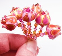
 Effetre's brand new Butternut color is so aptly named - it actually looks like real butternut squash to me!
As much as I really love fall colors, this one falls just a bit short for me, for several reasons, but I am going to start with the good points first.
 Butternut does act just like a coral in the flame - meaning it has a nice consistency and a dense color. It works well, and is neither stiff nor soupy.
This color does encase very well - in fact, that's probably the only way I personally would use it. It does not bleed a lot and keeps its bright color through a thick layer of clear.
 Its main negative point is that the glass does not stay bright yellow-orange, as I would like. The color tends to fade in and out and striate a kind of greyish green in some spots. This means it might be nice for organics, but for the kind of beads I make, it probably won't work. The golden yellow orange shade is lovely, but the grey streaks are a turn off.
I think I would be better off using one of Effetre's other regular yellow shades, like Dark Yellow or Red Roof Tile.


I make butternut squash soup and the colour of it is exactly the same as this glass! Yum! If I ever get hold of some here in the UK, I'd be tempted to try it, combined with another colour, as the top dot of a floral bead as the grey streak might enhance the appearance like a stripe on a petal.
ReplyDeleteUm, that's the Butternut glass as a top dot ... not the soup!!! :-)
ReplyDeleteLove the glass testing posts - saves me heaps of time in choosing glass colours - as I have yet to master the art of organics I like the test beads that you have made as they give me a general idea of what I am going to end up with.
ReplyDeleteWelcome to my blog (http://lianginbead.spaces.live.com/) to see my new works of beads.
ReplyDeleteLiang-In Liu from Taiwan
Fantastic Blog and I am loving these reviews! Really cool to hear about glass colors that I might have missed completley - fun stuff =)
ReplyDelete