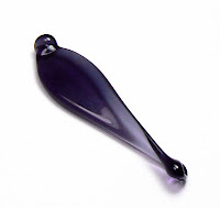
 I've been waiting for years for someone - anyone - in the glass manufacturing biz to release a navy blue color - in opaque or transparent. Effetre or Vetrofond (I can't remember which one) came close a bunch of years ago with an opaque Denim Blue - a color which, sadly, I cannot find anywhere anymore.
 A couple of months ago, CiM released Ink Blot - a limited run transparent color that is as close to navy blue as I have ever found. YEY!!!
Ink Blot looks very saturated in rod form, and if you hold it up to the light, it is a dark purply blue color. However, when melted, worked and annealed, it loses all the purple and a lot of the saturation, and flirts with blue/grey and navy.
By itself, as a spacer, it stays very dark. When encased, though, it sparkles with a lovely quality I can't quite describe. I would say that Ink Blot is most like CiM Midnight in color - although maybe a shade lighter.
What makes me happiest about this color is that it isn't stiff at all, when you compare it to colors like Midnight, which is gorgeous, but very, very stiff. Ink Blot melts like a dream, and layers very nicely, with no bleeding or feathering at all.
Ink Blot can be used as a blue/grey or as a navy blue, depending on which color you layer it with. I have used it with several shades of neutral grey, and also with Periwinkle and Dark Periwinkle. The navy blue comes out best when Ink Blot is layered with Periwinkle and encased in clear. In the beads below, left to right, Ink Blot is shown layered with various colors and encased in DH Aether; alone; with Effetre Pearl Grey; with Effetre Periwinkle; with Effetre Dark Periwinkle.
 |
 When used as decoration, Ink Blot lightens a lot and works really well as a neutral color, adding variety to any neutral palette, in my opinion.
In the sets here, with green, called Echo, Ink Blot is used as a grey, layered with Pearl Grey and clear. It works well as an encased stringer as well - a nice, light neutral grey.

The center beads, as well as the left bead in the lower set all use the Pearl Grey/Ink Blot/Aether encasement, and they stay nice and dark.
In these blue and cream sets, called Winter Lace, I used Ink Blot with Periwinkle to bring out the navy. This makes for a lovely wintery blue. (The spacers in the pic seen here are CiM Zachary, a shade lighter than Periwinkle).
 You can see how well the Ink Blot layers in the dots on the left bead in the last set. Very even and clean.
I am very impressed with the consistency and workability of this color, and very happy we finally have this shade in our 104 COE palette. Thank you
Creation is Messy! :)


Great post! Always love your beads! Thanks for the update! :)
ReplyDeleteGreat beads! Hugs, Doris
ReplyDelete