 |
| Sweetest Thing Sets - Feb 2013 |
We all know about signature designs in beadmaking. Whether or not we agree that there should be such a thing, it's hard to ignore the fact that some beads just scream the artist's name.
 |
| Venus Flowers - Oct 2006 |
Is there such a thing as a signature color scheme, though? I think so. I'm not talking about exclusive rights, mind you - I don't think there can be a right to claim an entire color scheme as one's own. That would be silly - there are only so many glass colors out there.
What I mean is that some beadmakers really identify with a particular color or group of colors. They've worked so much with these colors that they really know the glass in and out. When looking at these colors, the artist feels at home, familiar, content and even joyful. When people see those colors in beads, they might even recognize the beads as belonging to the artist - even if the designs are not as familiar.
 |
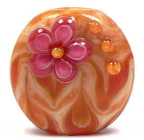
| Sweetest Thing Trio - Feb 2013 |
As an artist, I think I have one of those signature thingies. For years, I have loved making beads using a sweet combination of pink and yellow. I've called these beads a number of different names over time, depending on how they turn out, and on my whim.
It all started with the discovery of the nature of some of the handmade glass out there. Particularly, an Effetre handmade color called
Opal Yellow, an Effetre staple called
Rubino Oro (a.k.a. Gold Pink) and an Effetre mistake called
Streaky Pink. I realized that these three colors together did something really special, and I immediately fell in love.
 |
| Pure Joy - Mar 2006 |
Throughout the years, the glass changed slightly. Streaky Pink was no longer made, so I replaced it with various batches of
Effetre 256 Dark Pink - sometimes a frustrating venture. 256 has changed so much over time, that it's hard to predict how that glass will turn out. Sometimes it came in rich batches of pink (like the old Crazy Cane or Raspberry that I have run out of but still lust after).
Sometimes the batches were a lighter pink, but still struck slightly darker. Often, and more common lately, 256 is a lighter pink that shifts a greyer tone when worked. This means I have to work really hard to get what I want out of it. It's a challenge I still gladly take on in order to get the lovely combination I still find intoxicating.
Opal Yellow has also shifted through the years - sometimes striking deep peaches, sometimes striking an almost mustard-y yellow. Often staying lighter and even washing out. The same story goes for Rubino - a glass that's famous for being really unpredictable in its color and nature.
The one thing these glass colors all have in common is that they are striking colors that combine together to create an almost endless array of shades of pink, orange and yellow. They all layer so well and spread out to make glorious designs with an almost painted look.
 |
| Sunset - Feb 2004 |
The love affair started with a set I called Sunset. It's hard to believe I started making beads in these colors over 9 years ago! These first attemps were when I had only been making beads for a year or two, so please be gentle. :) My flowers were atrocious, so I concentrated more on layering and twisting dots. I also vetured into the world of cubes, which I found to be a lot of fun. These beads were made when I was still using a larger mandrel for the hole, which is why the beads are less round and more donut-y.
 |
| Sugar & Spice - Mar 2004 |
 |
| Pink Fire Focal - Feb 2004 |
 |
| Burst - Oct 2006 |
Over the years, I got better with my design work, but never lost my love for these colors. As you can see, my photography skills changed over the years, too - as well as my actual camera. Some of these pics show a real change in these colors, but that sometimes had more to do with lighting and such than the actual glass I used.
 |
| Dawn Flower - Jun 2007 |
By 2006, I was working on the smaller mandrels, and rounding out my beads a little more.I tried surface florals in these colors, but found that the spreading of the Rubino made the flowers distort more than I liked. Leaving the flowers slightly raised looks much better.
 |
| Pink Carnival - Mar 2006 |
I tried different shapes at that time, and found that pressing these colors sometimes yielded really pretty results. Etching them, however, wasn't as attractive. Rubino can sometimes etch unevenly, leaving a rough texture.
 |
| Sunshine - Jul 2006 |
 |
| Flame Tabs - Jun 2008 |
As time went by, I got the hang of these glass colors and their little idiosyncracies, refining the designs to bring out the shades' natural beauties.
These days, this color scheme is what I do when I am in need of comfort. When my mojo is off, and my muse is on vacation, I can always count on this scheme to come out at least somewhat nicely.
 |
| Flame Cubes - Jun 2008 |
Well, they look nice coming out of the kiln, anyway. Taking pics of these colors has been a serious challenge. Opal Yellow can look green-ish or more mustard-y in a picture than it does in real life. And the pinks can be washed out or even purple-y. Fine tuning the color in the photo-editing program (in my case, Paint Shop Pro X) requires a delicate hand and a sharp eye, or the pic can come out looking over-processed, as some of these do.
 |
| Fields of Joy - Jun 2008 |
I hope the more current beads look better in pictures, but the fact remains that they look infinitely better in the hand - at least I think so. The very last pic here is one of the batch of trios I just
listed on Etsy yesterday. I made them earlier this week, and still found bliss while at the torch. I hope you enjoy looking at all these pics, and that you had fun strolling down memory lane with me.
So, how do you feel about signature color schemes? Do you gravitate toward any one color combo - and can you think of any other artists that have one? I'd love to hear about it in the comments! Have a great day, everyone. :)
 |
| Bliss - Jun 2012 |


Candice, I was first drawn to your work because of these wonderful colors....when I see them I always think of you. I also remember some really bright, vivid colors that you were using a few years ago. They always reminded me of a Fiesta!
ReplyDeleteAs beautiful as they are I'm always a bit disappointed when you work with the darker colors...browns, purples. Silly I know...those beads are lovely...but the pinks and yellows just make my heart happy!
:) Thanks Debbie! I do like the darker colors sometimes, but I love the light and cheery too.
DeleteThank you for the blog. I love your signature colors.
ReplyDeleteI have to start by saying how much I LOVE the way you marry these colors together with your designs!! Such happy makers!! I do have certain color combinations that I feel very comfy with, and also certain designs. I'm not sure I have just one in particular, though. I guess I'd have to ask others that have seen my work if I do anything recognizable as "GMD" colors, or if I tend to be kinda all over the place on that. I know I like to get attached to a design for weeks on end and make it in every color combination I can think of til I tire of it and move on to the next obsession.
ReplyDeleteHi Gina! I adore your work, and always have. I think of you more as a master of certain designs than someone who has a color combo signature. I always think of lovely pressed flowers and and shapes in juicy colors when I think of you. You get attached to designs like I get attached to colors. :)
Delete