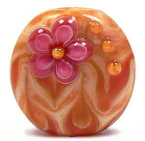
Showing posts with label images. Show all posts

Thursday, August 15, 2013

A Beadmaker's Signature Color Scheme...


Sweetest Thing Sets - Feb 2013
We all know about signature designs in beadmaking.  Whether or not we agree that there should be such a thing, it's hard to ignore the fact that some beads just scream the artist's name.


Venus Flowers - Oct 2006

Is there such a thing as a signature color scheme, though?   I think so.  I'm not talking about exclusive rights, mind you - I don't think there can be a right to claim an entire color scheme as one's own.  That would be silly - there are only so many glass colors out there.

What I mean is that some beadmakers really identify with a particular color or group of colors.  They've worked so much with these colors that they really know the glass in and out. When looking at these colors, the artist feels at home, familiar, content and even joyful.  When people see those colors in beads, they might even recognize the beads as belonging to the artist - even if the designs are not as familiar.

Sweetest Thing Trio - Feb 2013
As an artist, I think I have one of those signature thingies. For years, I have loved making beads using a sweet combination of pink and yellow. I've called these beads a number of different names over time, depending on how they turn out, and on my whim.


It all started with the discovery of the nature of some of the handmade glass out there.  Particularly, an Effetre handmade color called Opal Yellow, an Effetre staple called Rubino Oro (a.k.a. Gold Pink) and an Effetre mistake called Streaky Pink.  I realized that these three colors together did something really special, and I immediately fell in love.

Pure Joy - Mar 2006
Throughout the years, the glass changed slightly.  Streaky Pink was no longer made, so I replaced it with various batches of Effetre 256 Dark Pink - sometimes a frustrating venture. 256 has changed so much over time, that it's hard to predict how that glass will turn out.  Sometimes it came in rich batches of pink (like the old Crazy Cane or Raspberry that I have run out of but still lust after).

Sometimes the batches were a lighter pink, but still struck slightly darker. Often, and more common lately, 256 is a lighter pink that shifts a greyer tone when worked. This means I have to work really hard to get what I want out of it.  It's a challenge I still gladly take on in order to get the lovely combination I still find intoxicating.

Opal Yellow has also shifted through the years - sometimes striking deep peaches, sometimes striking an almost mustard-y yellow.   Often staying lighter and even washing out. The same story goes for Rubino - a glass that's famous for being really unpredictable in its color and nature.

The one thing these glass colors all have in common is that they are striking colors that combine together to create an almost endless array of shades of pink, orange and yellow. They all layer so well and spread out to make glorious designs with an almost painted look. 

Sunset - Feb 2004
The love affair started with a set I called Sunset. It's hard to believe I started making beads in these colors over 9 years ago! These first attemps were when I had only been making beads for a year or two, so please be gentle. :) My flowers were atrocious, so I concentrated more on layering and twisting dots. I also vetured into the world of cubes, which I found to be a lot of fun. These beads were made when I was still using a larger mandrel for the hole, which is why the beads are less round and more donut-y.
Sugar & Spice - Mar 2004
Pink Fire Focal - Feb 2004


Burst - Oct 2006
Over the years, I got better with my design work, but never lost my love for these colors. As you can see, my photography skills changed over the years, too - as well as my actual camera. Some of these pics show a real change in these colors, but that sometimes had more to do with lighting and such than the actual glass I used.
Dawn Flower - Jun 2007

By 2006, I was working on the smaller mandrels, and rounding out my beads a little more.I tried surface florals in these colors, but found that the spreading of the Rubino made the flowers distort more than I liked. Leaving the flowers slightly raised looks much better.

Pink Carnival - Mar 2006
I tried different shapes at that time, and found that pressing these colors sometimes yielded really pretty results. Etching them, however, wasn't as attractive. Rubino can sometimes etch unevenly, leaving a rough texture.
Sunshine - Jul 2006

Flame Tabs - Jun 2008

 As time went by, I got the hang of these glass colors and their little idiosyncracies, refining the designs to bring out the shades' natural beauties.

These days, this color scheme is what I do when I am in need of comfort. When my mojo is off, and my muse is on vacation, I can always count on this scheme to come out at least somewhat nicely.

Flame Cubes - Jun 2008


Well, they look nice coming out of the kiln, anyway.  Taking pics of these colors has been a serious challenge.  Opal Yellow can look green-ish or more mustard-y in a picture than it does in real life.  And the pinks can be washed out or even purple-y.  Fine tuning the color in the photo-editing program (in my case, Paint Shop Pro X) requires a delicate hand and a sharp eye, or the pic can come out looking over-processed, as some of these do.
Fields of Joy - Jun 2008

I hope the more current beads look better in pictures, but the fact remains that they look infinitely better in the hand - at least I think so. The very last pic here is one of the batch of trios I just listed on Etsy yesterday. I made them earlier this week, and still found bliss while at the torch. I hope you enjoy looking at all these pics, and that you had fun strolling down memory lane with me.

So, how do you feel about signature color schemes? Do you gravitate toward any one color combo - and can you think of any other artists that have one?   I'd love to hear about it in the comments!  Have a great day, everyone. :)

Bliss - Jun 2012

Joy - Aug 2013


Monday, May 27, 2013

Nope, I'm Not Flattered - And I'm Not Going Away

For those who have followed me and my work for the past decade or so - you've likely heard this all before. So feel free to skim or skip as you see fit.  For those who don't mind a bit of ranting, stay here and get ready.

This morning, several people alerted me to yet another website that has stolen an image of mine.  This one is slightly different than the dozens of other sites that have stolen my images to use to sell their copies of my beads - but I will go into that later.

This website - Indian Bead Store, aka Dev Exports has taken the below image and used it on their main website.
Midnight Mermaid bead set, made in June 2009

I can, of course, prove these beads are mine, because I have several other photos of them that aren't published online.  I also know what they're made of, how they're made, and can point to the fact that they carry my artistic voice.

I also talked about these beads in my post about CiM Mermaid, added to this blog in December 2009 (originally written in June, and moved over from my old Word Press blog).

Now, I'd like to talk a little about how people have responded to my many discussions about this kind of thing over the years, because I just need to get a few things off my chest.
First, I know most people are just trying to be helpful - and I really do appreciate that.  However, there are a few things being said to me that just don't help at all.

"It's because your beads are so beautiful!" - This comment (and its variations) is incredibly kind, but misguided.  The people who lift my images to use as marketing for their own work do not do so because of the beauty of my beads.  They do so because it is easy.  My website is www.lampwork.net. A simple search for lampwork brings up my website and all the images therein. I think the image thieves are looking for a quick and easy way to design their websites, and my images are right there, easy to lift.

Other artists don't have this problem nearly as often, because their website URL's are often their names or business names. I have thought of changing my web address, but I have had lampwork.net for over ten years.  It's established, and I think it would hurt my business to move.  But I am still considering it.

"You should be flattered!" No.  No I shouldn't.  I get no credit for the image, my name is nowhere on the site.  The images are usually taken because it is easy (see above), and because they think they can copy the beads. Often, they do.  This not only hurts my business, it makes me feel used and tossed aside. Yes, it's true that I should grow as an artist and make beads that are harder to copy.  I know this.  It's hard to grow as an artist when things keep happening that thwart motivation, though.

"You should watermark your pics!"  Yes, I tried this for years, but people were able to lift the images, remove the watermarks and proceed to post the images wherever.  A passing familiarity with photo editing software makes this pretty doable. So I stopped watermarking my pics because I think watermarks are ugly.

"Don't let this bother you - just ignore it!" and "You're letting them get the better of you!" This is a blatant disregard and invalidation of my feelings.  If I could ignore it, I would. I am sensitive. I admit it. It's really difficult for me to just turn a blind eye when I am being stolen from, used and when I lose business to bead exporters. It hurts me as an artist, and it hurts my bottom line. As far as I am concerned, this nerve is still exposed.  Whenever I think I am over it, it happens again.

I've also had people over the years post and email me that talking about this does no good, and is pointlessly negative. To those people, I say "Bite me". Talking about it not only helps me vent the anger and frustration and hurt - it also informs others that this is happening.

Legal action is not possible for me (overseas, expensive, etc), so all I can do to get some recourse is inform others. Posting about this online is the only way I can keep the issue relevant, and maybe stop people from buying from stores that refuse to do their own work and earn their keep legitimately.

I can't offer customers beads that are as cheap as those on an exporter's website.  But I can explain that they are not going to get what they see there, at all. Not even a little bit.

Now, I promised to explain why this particular website is different from the dozens of others that have stolen my images.  Here's why - Indian Bead Store and Dev Exports also sell glass rods.  More specifically, they sell something called "Dev Glass".  Looking at this glass on their website, it seems that this might be Devardi glass - an indian glass company that came on the market a few years ago.

I am not a fan of Devardi glass - their company or their business practices, and to have my beads on a website that sells this glass really makes me sick.  Plus, as a seller of this glass, which is used to make beads, this company should know better than to steal an artist's images to use as marketing for their own stuff. It's a slap in the face.  This website - Indian Bead Store/Dev Exports seems to be affiliated with Devardi glass.  If they are not, it's a huge coincidence.

At any rate, I would like to implore you, the bead buyer, collector and user, to refrain from buying from any website that steals artists' images for use as a marketing ploy, please. And spread this around if you feel like helping me out.  I would really appreciate it.

I'm done ranting for today - thank you for reading.

~Kandice

***Note - I received a very rude email from the owner of Devardi insisting they are not affiliated with this company. I am not certain whether or not I believe him.  He threatened legal action.  However, it's completely legal for me to state my opinion. I am still of the mind that this is no coincidence, but if I am wrong, well, I am wrong. I doubt that, though. I am still not a fan of Devardi, and never have been - something which I am completely within my rights to insist.