 |
| Radiant Orchid |
However, as I am sure lots of glass beadmakers would agree, it's kind of a mixed bag for us in the lampworking world. While Radiant Orchid is really beautiful, it's not an easy color to find in glass.
The closest hue I can see would be Effetre's 254 Opaque Purple, which is nicknamed EDP, or Evil Devitrifying Purple. Most glass beadmakers I have talked to have a love/hate relationship with EDP, me included. It's a singularly beautiful shade of orchid purple, but it has a habit of blooming into a chalky, yucky, pitted pinkish matte color when worked in the flame. Encasing it is damn near impossible.
 |
| One of the only times I used EDP successfully - as a base and as frit. |
These days, EDP has been reformulated and has come in several batches, each one having a little less of a tendency to devitrify, thank goodness. The most recent batch I bought doesn't devit nearly as much as the original, but it still bleeds and spreads when you layer it. Therefore, it's best used as a base, which really limits its usability for me. Frantz Art Glass has a blog post about working with devitrifying glass - and it is helpful for those beads that just have EDP as a base.
There are some beadmakers out there who do amazing things with EDP, and have learned how to coax out the best properties of the color - and to those miracle workers I doff my cap to you.
 |
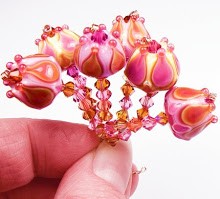
| Lavender glass with Rubino scrolls - somewhat close to Radiant Orchid? |


Hey K!
ReplyDeleteYup, that Pantone Radiant Orchid is EDP alright. What's amusing is I find when I peruse palette samples or blogs like Design Seeds, the palettes I'm ALWAYS attracted to are the ones with raspberry in them (I'm starting to thick raspberry goes with everything!), and I get so frustrated 'cause you just can't find an opaque raspberry. I can layer rubino over a pink or purple, like you have above, but transparent raspberry isn't what I want. I want opaque raspberry. *sigh* Anyway, I'm one of the lucky few that can work EDP and keep it from devitrifying. At least I have that. :)
Maybe a thin layer of rubino over EDP for my raspberry? I really should stock up on both, right now I have about 2 inches of EDP and a couple rods of rubino.
Love the blog, keep 'em coming! :)
I totally agree Aimee - I want opaque raspberry purple that is stable and clean!! :) Someday, hopefully. I'll keep bugging Kathy over at CiM to make that one. Thanks for the comment!
ReplyDelete