 Next in line for new CiM color tests are two shades of lavender called Enchanted and Rapunzel. Plus, since there are so many shades of lavender glass out these days, I decided to do a couple of comparison shots of the ones I happen to have on hand. Most of these are CiM, with a couple of Effetre thrown in for kicks. This is mostly just to show differences in color shifting, since they all have similar properties. More on that later. First, the newbies!
 Rapunzel is the opaque lavender - CiM created this to be an opaque version of their color Crocus, an opal lavender.
Rapunzel is a sweet shade that is just a little bit more pink and a touch brighter than the other opaque lavender CiM has called Heffalump. I would also say that Rapunzel is a touch more dense - meaning it's more opaque and tends to hold it's color without going as "ghostly" as the Heffalump does. We're not approaching the translucence of an opal color yet, but any lavender I have ever worked with is less dense than, say, the chalkiness of the pale opaque greens like Dirty Martini. However, Rapunzel is the densest of any opaque lavender I have worked with. That makes it really wonderful for layering with transparent purples and pinks!
 |
| Left to right - Crocus, Effetre Lavender, Rapunzel |
 | |
| Plain, encased in clear and Enchanted |
I did notice that when you put a metallic glass on top of Rapunzel and reduce, the lavender reduces a little as well, and you can see a hint of pinkish-greyish haze on the lavender in some places. You can see this in some of the beads below.
Like other lavender shades, Rapunzel will color shift under different kinds of light. Instead of going more bluish like Heffalump and Effetre Lavender, Rapunzel actually washes out a little more on the pink side. In sunlight, the lavender is more pronounced.
I am really happy CiM came out with a more dense lavender - I'll be buying a bunch of this when it comes out - hopefully it's not too terribly expensive!
 Next we have the transparent lavender shade Enchanted - another in a long line of very similar shades of lavender! I think for the most part that CiM tries melting the same lavender over and over, and they just get varied levels of saturation and color shifting properties, so they have to use different names for all the variations. That's cool with me - I love every one of them!
For the most part, Enchanted behaves very similarly when melted as its counterparts. A nice viscosity, not much in the way of scumming or bubbling, no shocking, and layers very well. Not too stiff, either, which is very nice!
Enchanted sits pretty much in the middle when it comes to saturation. Here's a pic of the lavenders I have on hand, under reveal bulbs that show true color. (Some of these are discontinued colors, fyi.)You can see that Enchanted is about the same saturation as the colors around it, but just a tiny touch pinker.
When it comes to color shifting, there are some differences. Enchanted stays on the purplish side when under fluorescent bulbs. You can see in this pic here (kind of crude but it does the trick) that several of the shades shift to a pale blue while others stay lavender-ish but kind of wash out. This is where you might want to consider what colors you are pairing the lavender with to decide whether you want a blue color shift or not. When in sunlight however, the vivid lavender comes out to play.
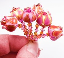
Here are some beads I made with Enchanted and Rapunzel, along with Dark Violet, Koala and Mockingbird.


Wonderful descriptions and comparisons! Thanks for doing all the heavy lifting here....so useful!
ReplyDeleteMy pleasure! :)
ReplyDeleteGreat post, Kandice! Terrific information! (And I definitely need some of these colors!)
ReplyDelete