 This post starts off the new batch of colors from Creation is Messy for the fall - yey!
On to the first two colors! These two colors seemed to match, so I tested them together.
First up is Chrysalis - which CiM says they formulated as an opaque version of Kryptonite - one of their popular opal colors. The color itself is a pastel minty blue/green. I would say first off that they were only a little bit successful making this an opaque color. Chrysalis can appear more opaque in some circumstances - and this ends up being a tricky thing to do - but a lot of the time it qualifies to me as a dense opal.
Chrysalis does have a nice consistency when melting, though - not too soupy and not too stiff. It behaves like an opal while being worked - going hazy-clear when melted and staying that way for a good amount of time while it cools. When making spacers I was able to get it to go opaque quite easily, but when pulling it into a petal there were spots of opaque and spots of translucence. Because of this color's paleness, this was hard to capture in a photograph.
 I did notice that when layering this color, it did stay somewhat opaque when thickly encased and cooled slowly. However, Chrysalis does have a tendency to bleed and feather to various degrees, depending on what you melt it on top of and how thickly you've covered it.
While working with this color, I couldn't find much consistency in how often it would go opaque or stay translucent - it felt kind of random to me. But I imagine that working with it for awhile would enable me to discover a pattern.
The color itself is quite lovely - of a similar tone as Kryptonite. I would love it if Chrysalis was as dense and opaque as Dirty Martini! As it is, I probably won't use this again, because it was so hard to layer.

Next, we have Siren - a transparent shade that was to be a remake of the color Aloe Juice - and for me it's a dead ringer! This is exciting, because Aloe Juice was one of my favorites, and I was sad when they ran out.
 Siren is a gorgeous shade of light green with just a hint of teal. I would call it pale teal green. It pretty much has the same simple characteristics as Aloe Juice, which I reviewed here. It's got great consistency, doesn't bubble or scum or shock, is a nice viscosity, and layers very well.
Siren is just a bit bluer than Appletini and slightly greener than any of the teal shades. It's a great addition to the palette, as there is no similar shade other than the sold-out Aloe Juice.
 |
| Aloe Juice on the left, Siren on the right |
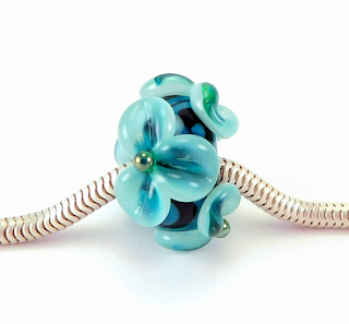
Here are some beads made with Chrysalis and Siren, along with black, Aloha, Trade Winds and the metallic Electra. More colors to come!


No comments:
Post a Comment