Showing posts with label double helix. Show all posts

Sunday, March 11, 2018

Glass Testing: CiM 912 Lilac and 557 Serenity

Happy weekend, everyone! Next on the docket we have two new CiM colors that I really loved.

First up is Lilac, a pale opaque lavender-pink. When I saw these rods I have to admit I wasn't all that impressed. After all, we have lots and lots of too-pale pinks and lavenders in the color palette, and one more wasn't going to do much for me. This is for two reasons - one is that most of these pale colors are just too pale for me when worked alone - especially when you don't layer them. Second is that the majority of the really pale pinks and lavenders are not as opaque as I need them to be - they're opalescent, which makes them hard to layer because they don't keep what little color they do have.

If it sounds like I'm picky - well, I am. Pinks and purples are tough cookies in the glass world!

Lilac is very, very pale - almost icy - and not really pink or lavender, but somewhere in between. However, it makes up for those things by being quite opaque and just a dream to melt. It's not as stiff as more opal glass, and doesn't lost it's opacity when layered. That means you can put darker transparent colors over it and it won't wash out or go see-through. When encasing it in clear, it does go lighter, as you might expect.

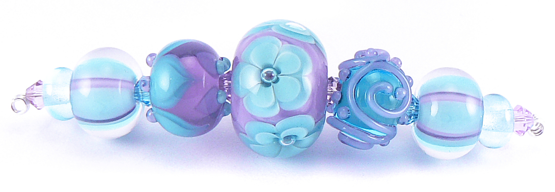
So for me, Lilac is a perfect color to layer with things like Rubino, Double Helix Rhea (as seen here), transparent Dark Violet and other saturated pinks and purples. Lilac holds its cool, icy tone well, shifting the reddish fuchsia in the Rhea to a colder hot pink fuchsia - perfect!

Lilac melts really nicely - I didn't have any shocking, which is a relief, since lots of glass seems shocky these days. There also wasn't any pitting or spreading or bleeding - just nice, smooth, opaque, pale color. The viscosity is pretty nice - not too soupy or too stiff.

Tiny little purple striations appeared in the pulled sampler of this color, but no striations appeared in the spacers or in the beads where the color is left bare. I imagine that using this color for sculptural work will lead to some striations.

(Below: Lilac is covered in Rhea on these beads - you can see that it holds its opacity well, even in the encased stringer.)


Next we have Serenity - a medium transparent teal. Now, CiM has done a lot of batches of transparent glass in the blue-green spectrum. Like, a lot. But I'm not mad at that. I love the variety of color. This particular shade sits right in the middle - it's bluer than both Aegean and Poolside, and greener than Zoe, Pulsar, Blue-yah! and Birthstone. It's medium in saturation, making it a lovely color to layer - my favorite thing to do!

There's not much to say about the workability of Serenity - I experienced no bubbles or scum (a nice departure from most transparent blues and greens), no shocking, no spreading or bleeding and no pitting. It's not too stiff, and doesn't seem to react to much - it's just your basic, easy glass.

In these beads, I layered it on top of Fremen, which is a light sky blue. I thought the outcome would be lighter, but I was pleasantly surprised at the lovely, vibrant shade of turquoise-teal that I got.

Serenity fits right into its own spot in the kind of crowded palette of blue-greens, but for me - the more the merrier, because I adore these colors!

**One note on the photography - the lighter the color, the tougher it was to photograph, and Lilac was one of those colors that my camera just hated.  Also, Serenity appears slightly washed out to me on camera - but all blue-greens do to me. They never, ever look the same in real life as they do on the screen - even in anyone else's pics. What I see is always more brilliant and multi-dimensional in real life than in a picture. My husband and I both think I can see these colors differently than other people, so I try to get the pics to be as close to what I think everyone else sees as I can. It's possible that I am a tetrachromat, but who really knows. Please do let me know if my pics ever seem way off - thanks!

(Below: Serenity is layered over Fremen, yielding a gorgeous turquoise)


More to come!


Wednesday, March 11, 2015

Glass Testing: CiM 716 Chateau Ltd. Run and CiM 530 Zoe Ltd. Run

Continuing on with the testing for the giant batch of new colors I got from Creation is Messy, today's colors are the gorgeous aqua called Zoe, and the soft neutral called Chateau.

First up is Chateau, and lovely transparent brownish beige. It reminds me a bit of cream soda, and is a nice alternative for Effetre's Light Brown transparent.

 According to CiM's website, this color was created to be similar to Sepia, but without the reddish undertone.  It fits the bill nicely - it's a true pale brown without any reddish or greenish undertones, and works nicely as an encasing layer for any browns or creams.

One thing I need to mention is that this glass can scum easily if you heat it too fast.  Work it under a cooler flame, and when using it as stringer, don't let it get too melty or it will bubble up.  It's not too stiff, so there's not much of an issue getting it to melt.

One other thing - when using this color with Effetre Sage (the new handmade version, not the machine made version) I had some severe compatibility cracks when making encased florals.  I am not sure what the culprit was - but using it under a thick encasement of clear (DH Zephyr) produced cracks like I have never seen. I didn't get cracks with other combinations of similar colors, so I have narrowed down the culprit to either Sage or Chateau. The cracking didn't happen in any other beads made with these colors - just the encased florals.  So just bear that in mind.

Other than that, I really love this color - it's a nice neutral that adds a soft beigy brown cast to anything it's layered with. 

Chateau layered with Effetre Mudslide makes a nice toffee color.
Chateau layered with Effetre Sage is a soft latte brown - use sparingly to avoid cracks.        

On to one of my very favorite selections in the new color batch - Zoe.  When CiM sent the new batch of colors, there were quite a few in the aqua/teal/blue range.  That thrilled me because I really love those colors.  Zoe is one of the best. For some reason, this color just shines and sparkles more than any aqua I've seen in any brand of glass.

Okay, enough gushing - on to the important stuff.

The first thing you need to know is that transparent aqua shades are a bitch to photograph.  Seriously.  The camera just does not capture the real color very well.  It doesn't even look right on the CiM website, which frustrates me to no end, because I want to relay to you, the color addict, just how gorgeous this aqua blue really is. 

CiM made this color to be a light version of Pulsar ( which is basically CiM's version of Effetre Dark Aqua) It succeeds - it's lighter and slightly less saturated than Pulsar, which I really like.  This makes it the perfect shade for springy aqua beads.

As usual, CiM's aqua glasses are better behaved than Effetre's - they don't scum or bubble or spread or bleed, etc.  Zoe is no exception. There may be some scummy spots when you first melt the rod, but those will disappear quickly as you melt the glass.  Zoe can take a lot of heat without burning out or bubbling, which makes it an ideal layering color.  Zoe isn't too stiff, which is also nice.

I think Zoe makes a wonderful layering color with either Effetre Light Sky Blue (for a brighter shade) or CiM Duck Egg (for a softer shade). 

As I mentioned before, there are several other aqua shades in the new CiM color batch. Most of these are very close in hue, with just tiny differences in the amount of green/blue and in saturation. I'm sure there are lots of opinions on which is best, but Zoe is my personal favorite. Since color love is subjective, your mileage may vary.  So far, I am of the opinion that any one of these aqua shades will be a great addition to your palette. :)
Zoe layered with Duck Egg (the purples are Heffalump, Dark Lavender and Pale Ink Blue)

Zoe layered with Duck Egg (the purples are Heffalump, Dark Lavender and Pale Ink Blue)

Zoe with Duck Egg as a raised floral is nice and bright.


Wednesday, November 10, 2010

AGLF Has a New Website, and I am Still in Love With Gray

I can't believe it's been a month and a half since I last posted here!  Time sure flies when you're busy.  :)

First off, I would like to announce the new website for the AGLF - aglf.info.  On the website are links to donate, buy the calendar, purchase beads, jewelry and other art, and more.  We would really appreciate your visit! For those who want to read more about AGLF and what it's about, please see my earlier post here.

As for beadmaking, I have been doing lots.  I am currently selling my beads in small sets in my newly re-opened Etsy store.  There's nothing there at the moment but tutorials, because the beads are selling as quickly as I can get them listed - which is wonderful!  So if you're looking for my beads, keep an eye on the store there.  I do email my mailing list when I put up a batch of beads, so if you want you can sign up for that at the bottom of my website.

And now for some beads!

CiM Adamantium remains one of my favorite colors of the season so far.   I am loving gray even more than brown this year - and this dark charcoal is just lovely for fall and winter.  I paired it with pink last week, and it turned out so pretty. 

Pink and gray remind me of my teenage years back in the 80's (OMG I'm so old...).  That color combo was everywhere, and I remember making friendship bracelets with embroidery floss in pinks and grays all the time.  Friendship bracelets.....ahhhh flashbacks.  :)

I'm looking forward to pairing this soft, dark grey with other colors such as pale blue, deep teal, light purple, and maybe some more black and white. 

I am also excited to be trying my hand at striking and reducing Double Helix Clio, a sweet pink/amber glass that reduces a soft metallic that I find heavenly.  I've already made some beads from it and will be making more.  I don't have pics yet, but look for these in my Etsy shop within a week or so! 

Have fun playing this week, and stay warm!

Sunday, July 19, 2009

Something About Aurae

So I used to hate silver glass. Why is that, when it's one of the most popular kinds of glass to use these days? Hmmmm - mostly because I tend to work cool and small, and the silver glasses tend to work very well in larger focals that have lots of glass layers and take a lot of heat and time to make.

I also had a hard time getting the really great reactions out of a lot of the silver glasses from Double Helix, TAG and more. Until now.

I finally broke down and bought some Double Helix Triton and Aurae after I read how easily they reduced with metallic effects, and after I read that Aurae would keep some of its metallic iridescence even when encased.

YEY! It's true - at least with Aurae (I haven't tried Triton yet). I found this glass incredibly easy to use - it reduces even easier than the Iris Blue I used in the beads in the last post. And the color is much lighter and more airy. Where Iris Blue reduces to a heavy silver, almost gunmetal color, Aurae goes golden and stays light. It has lovely reflective qualities, while still allowing some of the pale amber/rose to come through the gold.

The reaction is so easy to get that you almost don't have to do anything...just turn the oxygen down a little bit and make sure your flame isn't too terribly large or hot, and the golden glow quicky blooms over the whole bead. Add some clear to that gold and you have some lovely abalone shell iridescence. So. Pretty.

Here are my two first sets with it - and I plan on making more and more as time goes by. Next to try will be Triton - can't wait! :)