Showing posts with label beadmaker. Show all posts

Thursday, August 15, 2013

A Beadmaker's Signature Color Scheme...


Sweetest Thing Sets - Feb 2013
We all know about signature designs in beadmaking.  Whether or not we agree that there should be such a thing, it's hard to ignore the fact that some beads just scream the artist's name.


Venus Flowers - Oct 2006

Is there such a thing as a signature color scheme, though?   I think so.  I'm not talking about exclusive rights, mind you - I don't think there can be a right to claim an entire color scheme as one's own.  That would be silly - there are only so many glass colors out there.

What I mean is that some beadmakers really identify with a particular color or group of colors.  They've worked so much with these colors that they really know the glass in and out. When looking at these colors, the artist feels at home, familiar, content and even joyful.  When people see those colors in beads, they might even recognize the beads as belonging to the artist - even if the designs are not as familiar.

Sweetest Thing Trio - Feb 2013
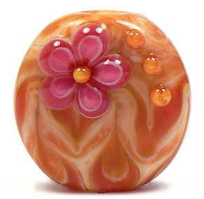
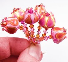
As an artist, I think I have one of those signature thingies. For years, I have loved making beads using a sweet combination of pink and yellow. I've called these beads a number of different names over time, depending on how they turn out, and on my whim.


It all started with the discovery of the nature of some of the handmade glass out there.  Particularly, an Effetre handmade color called Opal Yellow, an Effetre staple called Rubino Oro (a.k.a. Gold Pink) and an Effetre mistake called Streaky Pink.  I realized that these three colors together did something really special, and I immediately fell in love.

Pure Joy - Mar 2006
Throughout the years, the glass changed slightly.  Streaky Pink was no longer made, so I replaced it with various batches of Effetre 256 Dark Pink - sometimes a frustrating venture. 256 has changed so much over time, that it's hard to predict how that glass will turn out.  Sometimes it came in rich batches of pink (like the old Crazy Cane or Raspberry that I have run out of but still lust after).

Sometimes the batches were a lighter pink, but still struck slightly darker. Often, and more common lately, 256 is a lighter pink that shifts a greyer tone when worked. This means I have to work really hard to get what I want out of it.  It's a challenge I still gladly take on in order to get the lovely combination I still find intoxicating.

Opal Yellow has also shifted through the years - sometimes striking deep peaches, sometimes striking an almost mustard-y yellow.   Often staying lighter and even washing out. The same story goes for Rubino - a glass that's famous for being really unpredictable in its color and nature.

The one thing these glass colors all have in common is that they are striking colors that combine together to create an almost endless array of shades of pink, orange and yellow. They all layer so well and spread out to make glorious designs with an almost painted look. 

Sunset - Feb 2004
The love affair started with a set I called Sunset. It's hard to believe I started making beads in these colors over 9 years ago! These first attemps were when I had only been making beads for a year or two, so please be gentle. :) My flowers were atrocious, so I concentrated more on layering and twisting dots. I also vetured into the world of cubes, which I found to be a lot of fun. These beads were made when I was still using a larger mandrel for the hole, which is why the beads are less round and more donut-y.
Sugar & Spice - Mar 2004
Pink Fire Focal - Feb 2004


Burst - Oct 2006
Over the years, I got better with my design work, but never lost my love for these colors. As you can see, my photography skills changed over the years, too - as well as my actual camera. Some of these pics show a real change in these colors, but that sometimes had more to do with lighting and such than the actual glass I used.
Dawn Flower - Jun 2007

By 2006, I was working on the smaller mandrels, and rounding out my beads a little more.I tried surface florals in these colors, but found that the spreading of the Rubino made the flowers distort more than I liked. Leaving the flowers slightly raised looks much better.

Pink Carnival - Mar 2006
I tried different shapes at that time, and found that pressing these colors sometimes yielded really pretty results. Etching them, however, wasn't as attractive. Rubino can sometimes etch unevenly, leaving a rough texture.
Sunshine - Jul 2006

Flame Tabs - Jun 2008

 As time went by, I got the hang of these glass colors and their little idiosyncracies, refining the designs to bring out the shades' natural beauties.

These days, this color scheme is what I do when I am in need of comfort. When my mojo is off, and my muse is on vacation, I can always count on this scheme to come out at least somewhat nicely.

Flame Cubes - Jun 2008


Well, they look nice coming out of the kiln, anyway.  Taking pics of these colors has been a serious challenge.  Opal Yellow can look green-ish or more mustard-y in a picture than it does in real life.  And the pinks can be washed out or even purple-y.  Fine tuning the color in the photo-editing program (in my case, Paint Shop Pro X) requires a delicate hand and a sharp eye, or the pic can come out looking over-processed, as some of these do.
Fields of Joy - Jun 2008

I hope the more current beads look better in pictures, but the fact remains that they look infinitely better in the hand - at least I think so. The very last pic here is one of the batch of trios I just listed on Etsy yesterday. I made them earlier this week, and still found bliss while at the torch. I hope you enjoy looking at all these pics, and that you had fun strolling down memory lane with me.

So, how do you feel about signature color schemes? Do you gravitate toward any one color combo - and can you think of any other artists that have one?   I'd love to hear about it in the comments!  Have a great day, everyone. :)

Bliss - Jun 2012

Joy - Aug 2013


Tuesday, July 19, 2011

Beadmaking Tutorial Sale, and New Colors Coming Soon!

Okay, so usually when I do a tutorial sale (a few times a year) I do a buy-one-get-one-free kind of deal.  This sale is different.  Until midnight Friday night, all tutorials in my Etsy shop have been marked down by several dollars each.  There's no buying limit or minimum for this one.  This only counts for the Etsy store - the tutorials on Coloraddiction (the same ones) haven't been changed. That's because I don't want to change the PayPal buttons.  :)  So check out my Etsy store to see all 7 of my beadmaking tutorials on sale.

So....why the sale you ask?  Well, for a few different reasons.  First and most important - to help my current precarious financial situation. I won't lie - I am in a bit of a mess, and have been for awhile now.  Those who follow the blog know about the lawsuit, so I won't get into that except to say it's still going on.  We're struggling - like so many people out there - so every little bit helps.

Also, sales of tutorials have slowed a bit, and I want to give some extra incentive to get mine - which are great for newbies just getting into beadmaking, as well as intermediates who haven't run across my work until now.

Third, I am thinking of retiring a few of the older ones, so they will likely be disappearing after this sale is over. 

Will I be doing any new tutorials?  The answer to that is probably not for awhile.  I am a bit burned out on them and want to focus more on beadmaking.  Plus, I have run out of ideas.  :)

In other news - there are new CiM colors out to test, so look for new posts on those very soon.  CiM has made some gorgeous new greys that I am excited to try, as well as some opals that I really need to experiment with.  CiM has been releasing a lot more colors lately in their new Ltd Run category, and those will be fun to test.  I sure hope they continue to release colors which will be in their permanent line-up!

That's it for now - I hope everyone stays cool and has a fun summer!

Friday, April 15, 2011

Should I or Shouldn't I? A Beadmaking Tutorial Conundrum

So for the last few weeks, I have been tossing around the idea of doing another glass beadmaking tutorial.  I want to possible continue the Glass Color Families series and do maybe greens or purples.  Please bear with me while I do some "out loud" thinking on this idea.

Now, another color tutorial may sound like a fabulous idea at first, but I think a few things need to be considered before I decide to do it.

First, have you all been kind of inundated with too many tutorials these past couple of years?  Would one more just be too much?  After all - each tutorial costs somewhere between $10 and $25, and who can afford the zillion that are out there?

On the other hand, several people have suggested that they would like more color-specific tutorials, so maybe I am off base there.

Secondly, I already have a color blog - would a tutorial that costs money be a little overkill?  When I did the other Color Families tutorials (Browns and Pinks) I hadn't done a whole lot of blogging on specific color groups yet.  But now there are a whole lot of posts here on different glass colors.

On the other hand, I haven't covered every purple or every green out there (nor would I be able to, even in a tutorial - I can only cover what I have experienced), so there might be ample information to cover in a tutorial.  And my tutorials are a lot more detailed, with a lot more pics, than my blog posts are.

Finally, are people less interested in tutorials due to market saturation than they are in my actual beads, or is it the other way around?  To be honest, it's not easy to answer this question.  I sell some of both.  The economy may play more of a part in the demand for my work than actual interest does. 

So......the only solution is to ask you, dear visitors, what you think.  Would you be interested in a color-based tutorial?  Or is there some technique of mine you would be more interested in learning about? 

Would you rather see me focus on more beadmaking?  Although I have to admit that my beadmaking mojo has been severely lacking as of late, so there have been fewer beads available.

Do you already have some of my tutorials, and can you comment on their value?  I would love to know what you all think.  All suggestions, comments and questions are welcome.  Except for spam, of course. That will be summarily zapped.  :)

Tuesday, February 15, 2011

CiM Glass Testing: 497 Appletini and 500 Azure


I was so excited when I opened the package containing several new CiM colors ready for testing last week.....the brightness and saturation of CiM's new color selection is refreshing in this cold weather!

The first two colors I am going to review for you are two of the best in the group - Appletini and Azure.  I'll do Appletini first.

497 Appletini is pretty much what it sounds like - a light transparent apple green, crisp and springy. This shade falls somewhere between Effetre Pale Emerald and Effetre Yellow Green.  It fits nicely into the 104 coe palette - not an exact replica of anything, but close enough to substitute if you desire.

The main difference between CiM Appletini and its Effetre counterparts is that CiM's glass tends to be less scummy, clearer and a little stiffer.  This shade isn't as stiff as some CiM's transparents can be, so it was great for layering and encasing.

When I used it in these sets, I layered it over CiM Elphaba for a vivid spring green which turned out really lovely.  I did notice that it will bubble if you get it too hot, especially from the end of a stringer, so be careful with that.

Appletini doesn't have any reactive or striking elements that I could discern - it's a stable and consistent transparent color.  Not much in the way of spreading or bleeding - it stayed put on every bead I used it on.


CiM Azure is quite a different animal.  It's a super-saturated deep aqua shade that is darker and bluer than Effetre's Dark Aqua.  Its saturation reminds me of Effetre Intense Blue.

I have to tell you that images of this color might not do it justice.  What sometimes happens with saturated glass is that it can appear washed out in photos - at least with my camera.  I'm not sure of the technical aspects as to why, but it happens with most deep transparent colors - especially in the blue/aqua/teal lines.

In reality, Azure is so deep that I ended up encasing this spacer in clear to bring out the color.  And in the bead sets pictured, the azure is actually a lot more vivid and saturated than you might be able to see on your monitor.  The closest comparison I can come up with is that of Swarovski Capri Blue crystal beads, which are a near perfect match.

This bluer version of aqua isn't present anywhere else in the 104 palette, making it a really welcome addition, in my opinion.  When I pair it with Appletini/Elphaba, it just pops.  I can't help but think of summertime when I look at these colors together.  It makes me want to try on swimwear - and believe me when I say, that is totally not in my character!
 
The consistency of Azure is a bit stiffer than Appletini, but really clear and sparkling.  It doesn't bubble nearly as much as Effetre aquas tend to - it melts like butter.  It does need a slightly hotter flame, which makes layering a bit tricky when your opaque color isn't very stiff.  In these sets, the Azure is layered over Effetre Sky Blue, which is a soft opaque, so the Azure didn't spread out as much as I expected.  It still turned out pretty when the Sky Blue outlines appeared on many of the layers.

As with Appletini, for Azure I didn't notice any reactive or striking properties - just basic, stable color. 
I am really happy with these new colors so far - and CiM's website says that they will be available this March. Yey!

Wednesday, November 10, 2010

AGLF Has a New Website, and I am Still in Love With Gray

I can't believe it's been a month and a half since I last posted here!  Time sure flies when you're busy.  :)

First off, I would like to announce the new website for the AGLF - aglf.info.  On the website are links to donate, buy the calendar, purchase beads, jewelry and other art, and more.  We would really appreciate your visit! For those who want to read more about AGLF and what it's about, please see my earlier post here.

As for beadmaking, I have been doing lots.  I am currently selling my beads in small sets in my newly re-opened Etsy store.  There's nothing there at the moment but tutorials, because the beads are selling as quickly as I can get them listed - which is wonderful!  So if you're looking for my beads, keep an eye on the store there.  I do email my mailing list when I put up a batch of beads, so if you want you can sign up for that at the bottom of my website.

And now for some beads!

CiM Adamantium remains one of my favorite colors of the season so far.   I am loving gray even more than brown this year - and this dark charcoal is just lovely for fall and winter.  I paired it with pink last week, and it turned out so pretty. 

Pink and gray remind me of my teenage years back in the 80's (OMG I'm so old...).  That color combo was everywhere, and I remember making friendship bracelets with embroidery floss in pinks and grays all the time.  Friendship bracelets.....ahhhh flashbacks.  :)

I'm looking forward to pairing this soft, dark grey with other colors such as pale blue, deep teal, light purple, and maybe some more black and white. 

I am also excited to be trying my hand at striking and reducing Double Helix Clio, a sweet pink/amber glass that reduces a soft metallic that I find heavenly.  I've already made some beads from it and will be making more.  I don't have pics yet, but look for these in my Etsy shop within a week or so! 

Have fun playing this week, and stay warm!

Tuesday, June 22, 2010

Beadmaking Tutorial - What Would You Like to See?

Hi all!  Sooooo, I am planning on doing another tutorial.  I have a few ideas in mind, but I thought I would ask what you all might be looking for in another tutorial by me. You can choose one tutorial below as your favorite, or even suggest something new in the comments section.  Please feel free to elaborate!  You can see my other tutorials on Coloraddiction.com.

Here are some pics to show what kind of beads I am talking about.

Twisted Dot Beads


Flower Buttons


Stringer Decoration


Monday, December 21, 2009

New Tutorial Today!

Good morning all! Happy Holidays to those who are celebrating this winter season. I have been working all week and weekend on a new tutorial - I wanted to get this out before Christmas - and here it is!

For the last year I have gotten the occasional request for a tutorial on how I do my encased stripe beads. Now, I know this is not the most original technique out there, but there are a lot of beadmakers who haven't quite mastered this style. Also, I wanted to do more than just give a basic step by step on the stripe bead.

This tutorial does cover the basic stripe - but also talks about some of the variations to get a more vivid, complex stripe bead. I also give some advice about what colors I love to use, and a few colors that just don't play well. And of course, there are lots of pictures!

I came up with a price of $14 for this 17 page pdf file. I hope you will take a look and let me know what you think. Thanks!

Thursday, September 3, 2009

Glass Testing: Effetre 414 Butternut


Effetre's brand new Butternut color is so aptly named - it actually looks like real butternut squash to me!

As much as I really love fall colors, this one falls just a bit short for me, for several reasons, but I am going to start with the good points first.

Butternut does act just like a coral in the flame - meaning it has a nice consistency and a dense color. It works well, and is neither stiff nor soupy.

This color does encase very well - in fact, that's probably the only way I personally would use it. It does not bleed a lot and keeps its bright color through a thick layer of clear.

Its main negative point is that the glass does not stay bright yellow-orange, as I would like. The color tends to fade in and out and striate a kind of greyish green in some spots. This means it might be nice for organics, but for the kind of beads I make, it probably won't work. The golden yellow orange shade is lovely, but the grey streaks are a turn off.

I think I would be better off using one of Effetre's other regular yellow shades, like Dark Yellow or Red Roof Tile.

Glass Testing: Effetre Rosewood


This pretty color, which has no number that I can find, is a new one from Effetre which unfortunately has only been available at Frantz in their auctions. I am really hoping that this glass will be listed by rod there soon!


Rosewood is a lovely shade of burnt sienna/brick/terracotta that striates and stays nice and saturated.


It reminds me of a painted desert, and I think would make lovely spacers and a gorgeous base for organics.


I like the density of Rosewood - and its tendency to keep its bright color even when encased. It does spread, but only slightly, and was not difficult to layer.

I would LOVE to see Kimberly Affleck use this as a base for a seahorse! I think the woodsy, painted feel of this color lends itself very well to an organic look - but might even be nice with encased geometrics and florals.

I'll be keeping my eye out for this glass!

Glass Testing: Effetre 281 Marmorin Light

Continuing on with some glass testing today, I have three colors I am going to review. The first is Effetre's new semi-opaque called Marmorin Light (available at Frantz Art Glass in their Beyond Beauty Assortment).

This color is weird, but I can totally see how great this might be if used in making organic designs. It looks sort of moonstone-y in the rod, and when pilled into the petal for the swatch, it stayed that way.

In the flame, this glass goes a translucent dark grey that can kind of be hard to see when you're applying it to another dark glass, like black.

This seems to be a striking glass, going opaque gray in spots as you work it. You can get a stringer gray color by striking it over and over, allowing the color to cool and reintroducing it to the flame very slowly.

Marmorin light does tend to bleed a little bit, and does separate and striate a little as well. The effect can be seen in the encased spacer, here with Diamond Clear. You can also see it striate over black, which I think is a lovely effect.

The biggest surprise with this color was the tendency to turn an olive-ish grey in the kiln when used as a solid base. It certainly was nowhere near that color when I put it in there!

All in all, I think this color is interesting, but probably not a color I would use for my usual geometric and floral beads because if its reactive properties. I think it would make lovely olive-y spacers and a cool base for organics, though!

Saturday, August 29, 2009

Win a Tutorial!


Lori Greenberg is having a contest over on her blog to win one of my tutorials! She interviewed me last week on Beadnerd and decided to review the Raised Flower tutorial and have a giveaway. Take a look at her blog over on Beadnerd - it's a wonderful business blog for artists. Her personal beadmaking blog is great too! Thanks Lori!

Friday, May 22, 2009

Answers to Questions

Hi everyone - I want to thank you all for your comments on my last post.

Here are the answers to some of the questions in the comments section -

Yes, I did convo the person in question. She did reply to let me know that she had no idea the images were stolen - that she did indeed buy the banner and avatar from someone else on Etsy. That person's Etsy name is Tartsie, and it looks like their shop is empty.

I've contacted Tartsie, and I plan on contacting Etsy about it. However, I imagine Etsy can do nothing other than possibly kick Tartsie off Etsy if I can prove the banner/avatar came from them. I am not sure I can do that because the banner/avatar was a custom order.

To Alan - yes, I understand completely what you are saying. If someone bought my beads and took their own photo to use on their website, I would have no issue with it, unless they were insisting they made the beads themselves. That's still misrepresentation. I've only ever had that happen once, though. For the most part when this happens, people are using my own images to promote either their sales venue or their career as an artist.

Of course, if people are using my beads in their own work, that's completely different.It's an honor for me when I see my beads used in jewelry or other art.

Su - thank you for deciding to post about it on your blog - I appreciate that!

As for Jewlz076, she has asked for time to get another banner/avatar up, and I have decided to give her that time. It's not her fault someone was so unscrupulous as to sell her stolen images. It's my hope that she will ask whoever creates her banners to use images of her work - that would make the most sense.

And a heartfelt thank you goes out to the person who reported this to me - Angela. I really appreciate the time she took to look out for me. It was really kind of her.

Thursday, May 21, 2009

A Heartfelt Plea

This plea goes out to anyone who creates and sells handmade items online.

It's simple, really. Please use your own images to represent your work. Don't lift images from other artists, unless you have their express permission. If you do, you're hurting them and misrepresenting yourself!

Case in point - something that happens to me all too often - I was informed by a very nice person who is a member of Etsy that another Etsy seller is using my images in her banner and avatar for her shop. The image is of a bead set that I made and sold years ago to someone other than the seller who is using the image. The seller, whose Etsy page is here, appears to be a jewelry designer. Her shop looks relatively new, as she doesn't have many sales or any feedback from buyers.

Those beads were very special to me - as all my beads are. They are pieces of my soul.
It might be different if this were a customer of mine who made jewelry out of beads she bought from me, and had asked to use the image, but this is not the case. She is using my work to represent herself and her own work. This is misrepresentation and copyright infringement.

Here are the beads as I photographed them. You can see that her image is directly lifted from my own. The set is called Moonlit Magenta.

Please, people, when you do this it hurts. Take the time to learn how to take good pics of your own work. Don't steal images from someone else who has already put in that time and effort.

Also, please don't comment and tell me I need to watermark my images. I have done that and it doesn't deter the thieves - it just makes my pics look bad. They can find a way around it - believe me.

Anyway - there you have it again. Just another installment of Kandice's Seemingly Weekly Copyright Infringement Notification Service and subsequent gnashing of teeth.