Showing posts with label musings. Show all posts

Thursday, April 9, 2015

Grey is the Color of Introspection

It's been an eventful couple of months.  There have been two deaths in my family, two births in my family, one pregnancy announcement, a lot of travel, a lot of work, and the dissolution of a friendship which had become unbalanced and somewhat toxic.

When things get a little bit crazy, I tend to retreat inward.  The introversion and introspection that happens with me colors my work, naturally.

So I have been working with a lot of grey these last few weeks. The color grey for me brings to mind soft wool, cool days, quiet reflection, and the companionship of animals. It's also a professional color - clean and somewhat aloof.

Since it's spring, I've been pairing grey with lighter, more cheerful colors like peach, aqua, amethyst, pink and green.  The result is a kind of subtle balance of sweet and somber - which kind of goes along with this year's fashion color palette as well.

For me, the best grey glass colors are in the CiM line - Adamantium for the opaque, layered with transparents such as Raindrop, Journey and Twilight.

I love grey when I want to slow down and really focus on things, and I adore the way it makes the other colors stand out without being too fussy. It's my favorite neutral right now. :)


Monday, October 6, 2014

Glass Testing: Fritty Bits by Melanie Graham - Jabberwock

Who knew I would be testing frits?  Not me!  :) 

A couple of months ago I was approached by fellow glass artist Melanie Graham (Mind Melt Blog and Melanie Grahamn Studios).  She asked if I would be interested in testing her new frit line Fritty Bits (available on her website and on Etsy)

Melanie knew what most people who are familiar with my work know - I don't use a lot of frit in my beads.  I mean, next to none. Other than making stringer out of crushed aventurine, the last time I used frit was probably 8-10 years ago. Her question was - is it because I hate frit, or because there isn't a great deal of frit available in my preferred coe or color lines? 

The answer to that question is that there are a combination of reasons, some of which are artistic and some of which are more technical. I'll go into that later in this post.

I wasn't sure if I would be the best person for the job - mostly because of my inexperience with frit, and because I wasn't sure that my reviewing it would give her what she needs.  However, after discussing it, we agreed that having someone new-ish to frit test her product might be beneficial, and I think would help bring a more objective view of it to the blog.

Ultimately, Melanie and I agreed that I would test a few of her frits on a trial basis and see how that goes before testing more.

The first thing you should know about Fritty Bits is that it's all 104 COE and tested for compatability. That's a big deal for me, because one reason I stayed away from a lot of the other frit blends out there is because they incorporated other COEs, and I was always afraid of cracking. 

Now on to the tough stuff.  The majority of my opinions about frit in general are artistic in nature. That means that they are mostly based on my own personal preferences and my own creative voice.  It doesn't mean at all that I think others will have the same opinions - and it doesn't mean that I hope to dissuade anyone from trying any frit and judging for themselves what they like.  I hope that makes sense. :)

Now onto specifics!  Melanie sent me four frit blends to try, and I will be reviewing the first one in this post.

Jabberwock is the name of the frit blend that I picked to try first - mostly because it's autumn
and I thought the colors looked pretty seasonal.  And let's face it - the name is intriguing. Something named after a weird monster in a nonsensical poem just calls out to be tried. :)

This frit is a blend of greens and browns and mauves, made up of transparent and opaque glass, some of which is a tad reactive.

Because I am not a frit expert, I wasn't sure what to expect, other than what Melanie wrote in the notes she sent with the package - that Jabberwock was pretty on White or Opal Yellow bases, and could strike when worked.

So basically, I was just flying by the seat of my pants!  :)

The grain of this frit is pretty small, I think - which is good because I work small. I started with a small base bead of white and lightly rolled it in the frit and melted in.  Some of the pieces were too large (for me anyway) so they didn't stick to the bead.  I used tweezers to manually stick pieces where I liked.

Here's where we come to the biggest reason I don't use frit a lot - it's visually chaotic. I'm the kind of artist who loves order - symmetry and precision are a hallmark of my designs.  Color harmony and crispness are things I really like. I very rarely use organic, random design and color in my beads - which is just a personal preference.  I typically am not drawn to a chaotic, random color arrangement, and the more colors I see, the more chaotic it looks to me.The random nature of the shapes and sizes of the grains is also visually unappealing to me, usually.

When testing, I tried to ignore that and just focus on the technical aspect of the frit - does it work as intended?  Yes, I think so.

One thing about this frit (and I think most frits will have this issue, because of the sharp edges in the glass) is that it can cause a little scumming or bubbling when encased.  It's not that noticable, especially when you manipulate it, but I am picky about such things.

Here are some pics of my test beads, and some more info about each bead.

L-R 1.Opal Yellow base, not encased, twisted. 2. White base, twisted. 3. Periwinkle base, encased. 4. White base, raked, encased. 5. White base, encased.
The first test I did was just the frit on an Effetre White base, encased.   The clear I used for encasing was DH Aether (which is reactive to silver glass). The first thing I noticed was that the colors are very subtle, except for the deep oxblood brown shade, which strikes darker and with a blue tinge when worked. I was not fond of this in just a plain bead without any manipulation.

I then did two more beads with white bases, and did twisting on one and raking on the other.  The raked bead was most appealing to me, as the colors blended a little and reacted with the DH Aether somewhat.

The most reaction came when I rolled the frit onto an Opal Yellow base and then twisted the spots. The frit spreads a little on Opal Yellow. The Periwinkle based bead also reacted a little but with darker lines around the frit spots.


To be honest, I would probably not use this frit in my designs, because I find the colors a bit muddy, and I don't really like the interplay of the deep opaque and the softer transparents. But again, that is a matter of personal preference. I am sure there are lots of beadmakers who could really make this color blend sing!  The sample beads on the Etsy page for Jabberwock are quite nice.

I will test the rest of the colors Melanie sent and do a review of each one separately.
Next up is Blue Jeans!

Saturday, September 13, 2014

Glass Beadmaking: Absence of Color - Focusing on Design

This time of year, I usually start making beads in fall colors - purples, ambers, oranges, greens, browns, etc. For some reason this year, I remain sort of uninspired.  Maybe it's the weather (which has been uncharacteristically warm in the Northwest this year). Maybe it's the stress. Who knows. So, I decided to take the color out of the equation this week and just work with black and white. 
Glass used: Vetrofond Black, Effetre White and Double Helix Aether.
Working with black and white is fun because the stability of the glass I use allows me to go crazy with stacking, masking, raking and twisting, and still end up with crisp, clear designs on the beads.
My favorite bead uses encased white stringer with masked black and white dots.

For black, I primarily use Vetrofond Black. It's sad, though, because it's been discontinued and I can't find it anywhere anymore.  I am down to my last two rods (!!)  I am hoping that CiM Hades will work in its place, but we'll have to see.

For those who are unaware, all black glass is not alike.  The reason why is that black is not an opaque color - it's a very, very dark transparent color, technically speaking.  Effetre Black, which I think is the most commonly used black glass out there (in beadmaking anyway), is really just a super dark transparent plum/purple. It's not dark enough to prevent it from bleeding into other colors, though, and that's most evident when you use it with white.  Lines are not as crisp, and you can see a slight purpling of the edges of the white when both are layered together.

Most other black glasses I have used have similar issues. They either spread, feather or discolor any pale opaque color used with them.

Some black glasses are actually made that way on purpose (Effetre Intense Black for instance). Some beadmakers are very adept at using that property to their advantage when making beads with organic, freeform designs.

Vetrofond Black is great, because it is based in blue and not purple, and it seems to be darker and to have more stability.  So the lines are really crisp, and there is very little bleeding.

CiM has several black glasses, and I have read that Hades is the best when it comes to stability and darkness.  Yey!  In the meantime, I am going to keep my eye out for stashes of Vetrofond Black.

Beads with designs close to the holes
I got a lot of joy making black and white beads this week.  I think my designs have gotten more intricate over the years, and my beads have gotten slightly smaller.  I really love tiny intricate work!

 I've also been focusing on asymmetry - making the designs pull focus toward the hole and not toward the center of the bead. Just for fun and visual interest.

Next week, it's back to fall colors, I think.  I really do love autumn, so hopefully inspiration will find its way back to me. :)

These are all available on my website of you're interested.


Thursday, August 14, 2014

Beadmaking Tutorial Sale and other stuff

Hi all!

I am having a three day sale on all of my tutorials - you can get 33% off by entering the code "3daysale" in your shopping cart!

This includes all of the tutorials listed under "Kandice's Tutorials" on the Tutorials page. This does not apply to Etsy listings - just the ones on Coloraddiction. This does include the Pumpkin tutorial - and it's the perfect time of year for that one!


I just finished updating Coloraddiction, adding all the new color blogs to the list on the Tutorials page for easy reference.


I've got more colors to test - just getting the time to start doing that!  I'll be posting about Tiger Lily (a bright orange) later today I think.  Also on tap is the light opaque pink called Primrose, and the opaque grey called Cobblestone. I am unsure about whether I will be testing the opal colors they have out - I am not keen on opal colors as you may have noticed.  :) There are also quite a few red shades, and I might do one or two of those.


In the coming weeks and months, I will also be testing some new frit colors called FrittyBits by Melanie Graham!  This is a huge departure for me - I am not one for using a lot of frit in my beads.  But my muse needs a refresher in creativity, so I think it will be a fun challenge. Look for that soon!

That's about it on the news front - see you later!

Friday, May 9, 2014

Bead Soup Blog Party - Blog Hop Reveal!!

8th Bead Soup Blog Party List of Participants' Blogs

Finally, the day we all have been waiting for - the big reveal!  I'm writing this on Friday, and have it set up to post at midnight eastern time tonight/Saturday morning - hopefully it will work.

First, I would like to say thank you to the party administrator Lori Anderson.  She is so amazing - throughout all of this huge thing, and with everything she has been going through in her life.  I would never have been able to handle something like this, so kudos and hugs to her!

Now, as many people might have already guessed, this is my first time participating in what has become a very popular event.  I'm first and foremost a glass beadmaker - I rarely make jewelry, and I almost always use lampwork in any that I do make.  So this was a huge challenge for me, not knowing what I would get and having a deadline to create something out of unfamiliar components.

I have to say, it was really fun!  I am proud of myself for actually being able to come up with something that I think looks nice and used every single thing I was sent.

My partner in this party is Kat BarronMiller of Midnight Kat Productions.She sent me this gorgeous selection of beads - you can see the blog post about them here

The soup was beautiful, and it took me a few weeks of pondering to finally decide how to use it.  I knew from the beginning that I wanted to add pops of color to bring out the lovely autumn tones in these stones and in the brass findings.  I wanted to enhance the red and complement it, so I added some scarlet glass pearls and some amethyst gemstone beads.  I also added tiny metallic purple glass pearls and some deep chocolate brown pearls - some shiny and some with a matte finish for visual interest.


Stringing the necklace was pretty simple, so I started with that - adding two strands so the wearer could twist them if they liked. The brass wire really worked nicely - easy to wrap into connectors. I really love the look of the brass chain with the pearls, too.


The tricky part was coming up with a pendant that would incorporate all of the larger pieces - the dragonfly and flower, and also the agate focal.  I know we were't required to use everything, but I loved all three, so I couldn't leave any of them out.

I've never used anything this large in my jewelry, so it took me awhile to figure out what to do.  At first I thought I might glue the dragonfly to the stone, but I really wasn't sure I wouldn't make a huge mess of that, and I doubted it would come off if I messed it up.  So I decided to just make a sort of wire bail with the chocolate pearls, and then hang the dragonfly in front of the stone with some chain links.  The effect is somewhat cumbersome when handling the necklace, but once it's on, it hangs well.


I connected the flower element above the pendant using the flat connectors and some chain.  It's a little odd-looking, but I like it.


Lastly, I attached the pretty clasp.  The pearl strands are strung on Soft Flex wire and crimped, so the whole thing feels pretty substantial and strong.


I had tiny dragonfly charms left, along with vintaj drops, connectors, and balls, so I made some earrings to go with the necklace. I love these teeny litle dragonflies!  The whole ensemble reminds me of fall, which is just my thing.

Now, strangely, I don't wear a lot of jewelry, and don't have pierced ears anymore, so I will likely give this to someone I love as a present.  :)

My muse had a great time with this challenge - thanks to all for reading!

Now, go forth and visit all the other fantastic artists!
8th Bead Soup Blog Party List of Participants' Blogs

Saturday, March 8, 2014

Bead Soup Blog Party - Blog Hop Partner Kat BarronMiller!

As you may know, I am participating in the giant blog party called Bead Soup this year, for the first time.  I just got my partner, so I thought I would tell you all about her.

Her name is Kat BarronMiller, and she is a fantastic jewelry artist! She runs a website called Midnight Kat Productions, with an accompanying blog and Etsy store.

What I really love about her work is her current fascination with steampunk, and her wonderful wire wrapping.

We will send eachother some beads, a clasp and a focal, and then each make something out of those items to show off on our blogs. The blog hop will be on May 3rd, so make sure you visit then to see all the amazing eye candy!

I am so excited for this.  I have been in a bit of a creative funk lately, but this is sure to challenge my muse to make something completely different and fun. And I can't wait to see what Kat will make with the beads I send her. Stay tuned! :)

Tuesday, January 7, 2014

Frantz Art Glass Introduces "Try Before You Buy" Program

Something really cool just popped up for beadmakers and other glass artists who love glass color!  Frantz Art Glass - my favorite glass supplier - announced a few days ago that they were going to allow customers to try new colors before buying them.

According to their website, this means that when you make a purchase there, you can choose up to 2 new glass colors and receive a free rod of that glass to try out.

I have to say that I am pretty excited about this.  Frantz gets new Effetre colors in pretty often - and posts pics of them on their website.  However, it's sometimes really hard to tell just by the paddle picture what that glass is going to end up really looking like in a bead.  A lot of new colors look nothing like the pic on the Frantz website, for a number of reasons. That makes it hard for customers to commit to buying even a quarter pound of it to try out.

This new program is a wonderful opportunity for those of us who are addicted to new colors, but can't afford to buy them all, knowing some of them won't work out.

I know I am excited to try their new Navy Blue opaque glass - a color I have been waiting forever for!  You can even try the latest batch of EDP 254 - the opaque purple I wrote about in my last post, the one that works for Pantone's 2014 color of the year. Canyon - a light turquoise blue - also looks really pretty.

You can bet I will be snatching up a couple of free rods the next time I order.  Hopefully there will be some left!

Check out their newsletter here. (nope, I don't get a kickback for blogging this - I just love them)  Have fun!

Thursday, August 15, 2013

A Beadmaker's Signature Color Scheme...


Sweetest Thing Sets - Feb 2013
We all know about signature designs in beadmaking.  Whether or not we agree that there should be such a thing, it's hard to ignore the fact that some beads just scream the artist's name.


Venus Flowers - Oct 2006

Is there such a thing as a signature color scheme, though?   I think so.  I'm not talking about exclusive rights, mind you - I don't think there can be a right to claim an entire color scheme as one's own.  That would be silly - there are only so many glass colors out there.

What I mean is that some beadmakers really identify with a particular color or group of colors.  They've worked so much with these colors that they really know the glass in and out. When looking at these colors, the artist feels at home, familiar, content and even joyful.  When people see those colors in beads, they might even recognize the beads as belonging to the artist - even if the designs are not as familiar.

Sweetest Thing Trio - Feb 2013
As an artist, I think I have one of those signature thingies. For years, I have loved making beads using a sweet combination of pink and yellow. I've called these beads a number of different names over time, depending on how they turn out, and on my whim.


It all started with the discovery of the nature of some of the handmade glass out there.  Particularly, an Effetre handmade color called Opal Yellow, an Effetre staple called Rubino Oro (a.k.a. Gold Pink) and an Effetre mistake called Streaky Pink.  I realized that these three colors together did something really special, and I immediately fell in love.

Pure Joy - Mar 2006
Throughout the years, the glass changed slightly.  Streaky Pink was no longer made, so I replaced it with various batches of Effetre 256 Dark Pink - sometimes a frustrating venture. 256 has changed so much over time, that it's hard to predict how that glass will turn out.  Sometimes it came in rich batches of pink (like the old Crazy Cane or Raspberry that I have run out of but still lust after).

Sometimes the batches were a lighter pink, but still struck slightly darker. Often, and more common lately, 256 is a lighter pink that shifts a greyer tone when worked. This means I have to work really hard to get what I want out of it.  It's a challenge I still gladly take on in order to get the lovely combination I still find intoxicating.

Opal Yellow has also shifted through the years - sometimes striking deep peaches, sometimes striking an almost mustard-y yellow.   Often staying lighter and even washing out. The same story goes for Rubino - a glass that's famous for being really unpredictable in its color and nature.

The one thing these glass colors all have in common is that they are striking colors that combine together to create an almost endless array of shades of pink, orange and yellow. They all layer so well and spread out to make glorious designs with an almost painted look. 

Sunset - Feb 2004
The love affair started with a set I called Sunset. It's hard to believe I started making beads in these colors over 9 years ago! These first attemps were when I had only been making beads for a year or two, so please be gentle. :) My flowers were atrocious, so I concentrated more on layering and twisting dots. I also vetured into the world of cubes, which I found to be a lot of fun. These beads were made when I was still using a larger mandrel for the hole, which is why the beads are less round and more donut-y.
Sugar & Spice - Mar 2004
Pink Fire Focal - Feb 2004


Burst - Oct 2006
Over the years, I got better with my design work, but never lost my love for these colors. As you can see, my photography skills changed over the years, too - as well as my actual camera. Some of these pics show a real change in these colors, but that sometimes had more to do with lighting and such than the actual glass I used.
Dawn Flower - Jun 2007

By 2006, I was working on the smaller mandrels, and rounding out my beads a little more.I tried surface florals in these colors, but found that the spreading of the Rubino made the flowers distort more than I liked. Leaving the flowers slightly raised looks much better.

Pink Carnival - Mar 2006
I tried different shapes at that time, and found that pressing these colors sometimes yielded really pretty results. Etching them, however, wasn't as attractive. Rubino can sometimes etch unevenly, leaving a rough texture.
Sunshine - Jul 2006

Flame Tabs - Jun 2008

 As time went by, I got the hang of these glass colors and their little idiosyncracies, refining the designs to bring out the shades' natural beauties.

These days, this color scheme is what I do when I am in need of comfort. When my mojo is off, and my muse is on vacation, I can always count on this scheme to come out at least somewhat nicely.

Flame Cubes - Jun 2008


Well, they look nice coming out of the kiln, anyway.  Taking pics of these colors has been a serious challenge.  Opal Yellow can look green-ish or more mustard-y in a picture than it does in real life.  And the pinks can be washed out or even purple-y.  Fine tuning the color in the photo-editing program (in my case, Paint Shop Pro X) requires a delicate hand and a sharp eye, or the pic can come out looking over-processed, as some of these do.
Fields of Joy - Jun 2008

I hope the more current beads look better in pictures, but the fact remains that they look infinitely better in the hand - at least I think so. The very last pic here is one of the batch of trios I just listed on Etsy yesterday. I made them earlier this week, and still found bliss while at the torch. I hope you enjoy looking at all these pics, and that you had fun strolling down memory lane with me.

So, how do you feel about signature color schemes? Do you gravitate toward any one color combo - and can you think of any other artists that have one?   I'd love to hear about it in the comments!  Have a great day, everyone. :)

Bliss - Jun 2012

Joy - Aug 2013


Monday, May 27, 2013

Nope, I'm Not Flattered - And I'm Not Going Away

For those who have followed me and my work for the past decade or so - you've likely heard this all before. So feel free to skim or skip as you see fit.  For those who don't mind a bit of ranting, stay here and get ready.

This morning, several people alerted me to yet another website that has stolen an image of mine.  This one is slightly different than the dozens of other sites that have stolen my images to use to sell their copies of my beads - but I will go into that later.

This website - 
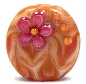
Indian Bead Store, aka Dev Exports has taken the below image and used it on their main website.
Midnight Mermaid bead set, made in June 2009

I can, of course, prove these beads are mine, because I have several other photos of them that aren't published online.  I also know what they're made of, how they're made, and can point to the fact that they carry my artistic voice.

I also talked about these beads in my post about CiM Mermaid, added to this blog in December 2009 (originally written in June, and moved over from my old Word Press blog).

Now, I'd like to talk a little about how people have responded to my many discussions about this kind of thing over the years, because I just need to get a few things off my chest.

First, I know most people are just trying to be helpful - and I really do appreciate that.  However, there are a few things being said to me that just don't help at all.

"It's because your beads are so beautiful!" - This comment (and its variations) is incredibly kind, but misguided.  The people who lift my images to use as marketing for their own work do not do so because of the beauty of my beads.  They do so because it is easy.  My website is www.lampwork.net. A simple search for lampwork brings up my website and all the images therein. I think the image thieves are looking for a quick and easy way to design their websites, and my images are right there, easy to lift.

Other artists don't have this problem nearly as often, because their website URL's are often their names or business names. I have thought of changing my web address, but I have had lampwork.net for over ten years.  It's established, and I think it would hurt my business to move.  But I am still considering it.

"You should be flattered!" No.  No I shouldn't.  I get no credit for the image, my name is nowhere on the site.  The images are usually taken because it is easy (see above), and because they think they can copy the beads. Often, they do.  This not only hurts my business, it makes me feel used and tossed aside. Yes, it's true that I should grow as an artist and make beads that are harder to copy.  I know this.  It's hard to grow as an artist when things keep happening that thwart motivation, though.

"You should watermark your pics!"  Yes, I tried this for years, but people were able to lift the images, remove the watermarks and proceed to post the images wherever.  A passing familiarity with photo editing software makes this pretty doable. So I stopped watermarking my pics because I think watermarks are ugly.

"Don't let this bother you - just ignore it!" and "You're letting them get the better of you!" This is a blatant disregard and invalidation of my feelings.  If I could ignore it, I would. I am sensitive. I admit it. It's really difficult for me to just turn a blind eye when I am being stolen from, used and when I lose business to bead exporters. It hurts me as an artist, and it hurts my bottom line. As far as I am concerned, this nerve is still exposed.  Whenever I think I am over it, it happens again.

I've also had people over the years post and email me that talking about this does no good, and is pointlessly negative. To those people, I say "Bite me". Talking about it not only helps me vent the anger and frustration and hurt - it also informs others that this is happening.

Legal action is not possible for me (overseas, expensive, etc), so all I can do to get some recourse is inform others. Posting about this online is the only way I can keep the issue relevant, and maybe stop people from buying from stores that refuse to do their own work and earn their keep legitimately.

I can't offer customers beads that are as cheap as those on an exporter's website.  But I can explain that they are not going to get what they see there, at all. Not even a little bit.

Now, I promised to explain why this particular website is different from the dozens of others that have stolen my images.  Here's why - Indian Bead Store and Dev Exports also sell glass rods.  More specifically, they sell something called "Dev Glass".  Looking at this glass on their website, it seems that this might be Devardi glass - an indian glass company that came on the market a few years ago.

I am not a fan of Devardi glass - their company or their business practices, and to have my beads on a website that sells this glass really makes me sick.  Plus, as a seller of this glass, which is used to make beads, this company should know better than to steal an artist's images to use as marketing for their own stuff. It's a slap in the face.  This website - Indian Bead Store/Dev Exports seems to be affiliated with Devardi glass.  If they are not, it's a huge coincidence.

At any rate, I would like to implore you, the bead buyer, collector and user, to refrain from buying from any website that steals artists' images for use as a marketing ploy, please. And spread this around if you feel like helping me out.  I would really appreciate it.

I'm done ranting for today - thank you for reading.

~Kandice

***Note - I received a very rude email from the owner of Devardi insisting they are not affiliated with this company. I am not certain whether or not I believe him.  He threatened legal action.  However, it's completely legal for me to state my opinion. I am still of the mind that this is no coincidence, but if I am wrong, well, I am wrong. I doubt that, though. I am still not a fan of Devardi, and never have been - something which I am completely within my rights to insist. 


Saturday, July 21, 2012

Why am I dreading The Gathering? And more news...

Okay, maybe "dreading" is to harsh a word....but I can safely say that I am extremely anxious about attending the ISGB Gathering this coming week/weekend.  Fair warning - I'm about to pour my heart out here.

When I first heard that the Gathering was coming to the Seattle area this year (specifically Bellevue, which is just minutes away from my home in Maple Valley, WA) I was really excited about it.  I definitely wanted to attend, and participate in everything I could.  After all, THE beadmakers' convention doesn't come to the west coast all that often.  I've been to only two other Gatherings - the one in Portland in 2004, and the one in Oakland in 2008. Both were a great time!  The idea that the convention would be so close was really an incentive to me - no travel, home nearby, a familiar place, etc.

So I signed up - for the main convention (complete with seminars),and the banquet.  I also signed up for half a table at the Bead Bazaar (sharing with my friend Kim) on Saturday.  I had planned on donating to several of the projects, and taking part in some of the contests. 

A few months ago, life really got in the way of all my plans.  Severe family issues cropped up and brought my creativity, motivation, energy, mental faculties all to a screeching halt. I know it sounds all melodramatic and catastrophic.... but that's how I have been feeling lately.  Both sides of our family - my husband's and my own - had some major things come up at the same time.  It was kind of an onslaught of confusion and heartbreak that took me completely by surprise. 

Since these events, I have had a pretty rough time keeping up with things.  I've been doing custom orders, and really little else.  No glass testing, no new beads for sale, no experimenting, nothing like that.  And certainly, no inventory for the Bead Bazaar.  At all.  I have like a handful of beads to bring to the Gathering - most of which are extras from the custom orders. 

Things just....fell apart for me.  The depression has been crushing, and I don't really know when it will get better. 

So as it sits for the Gathering.... I am supposed to have half a table - but I have nothing to stock it with.  So I am basically giving my half to Kim - even though the tables aren't supposed to be transferrable.  I am hoping the people in charge will understand.  I haven't emailed them because the deadline for a refund on the table has long past, and I am embarrassed about it.  If nothing else, I will help Kim at the table with her stuff, allowing her to take breaks and shop and such as she needs.  I'll have my business cards to hand out for people who want to place orders, or buy tutorials - and I will have a few beads for trading and maybe for sale, but that's pretty much all.

One thing which does sound promising is that Creation is Messy will have some new colors soon that I can test - including transparent and opaque peach shades, which we have been asking for forever. They (as well as the other new colors) look really lovely.  

As for the rest of it.... I missed all deadlines for the contests/projects, but I am hoping to donate some beads to the Beads of Courage, if they have a booth there.  And I am going to try and attend all the seminars and such. 

With this kind of depression and anxiety, I don't know how what kind of company I will be, but I will try and have a smile on my face, and hopefully I can snap out of it long enough to commiserate with my fellow artists and maybe be inspired.

But I am really nervous, and haven't yet been able to build up much enthusiasm for this event, which in the past I have really loved. When I am depressed and under a lot of stress, I tend to have issues with crowds and am prone to panic attacks. I hope that changes soon.

So why am I telling you all this - and laying it on so thick?  Well, part of it is in the hopes that if you are there, and see me, you won't judge me too harshly if I am quiet and have not much to show. Partly, it's also to apologize for my utter lack of preparation for this show.

As at the Oakland Gathering, I will have my tarot cards with me as kind of a social anxiety security blanket. I most likely won't come up and strike up a conversation with people - that's just not in my makeup right now. I hope that won't make me look like a stuck up antisocial brat.  Just a fragile artist trying to get through some tough times, and maybe talk herself into having a good time at the Gathering. Crossing my fingers.


Wednesday, February 8, 2012

A Bit of News and Miscellaneus Stuff

Hi everyone!  Hope your February is going well!

Just a couple of housekeeping things real quick...

Stay tuned for a post on CiM Reds coming very soon. I've been testing some of the new reds and an old favorite! I also get help from Kimberly with some of these reds since she loves red glass much more than I do. The testing was really enlightening, so check back to see the post later this week.
An update on my book on color theory - it's coming along slowly but surely! It's probably going to be a lot larger than a normal tutorial from me, because I have a lot more information to get out there, so it's taking longer than I thought. My best guess for release is sometime in June.  Hopefully it will be worth the wait!  :)

And finally - some pics of my latest beads! I've been having fun with cubes and lentils this past week. These are on Etsy at kseeber.etsy.com. Enjoy! :)

Tuesday, June 14, 2011

Transparent Glass; Simple Can Be Beautiful

I sometimes get caught up in creating complex color schemes using layers of glass to create new shades. I spend lots of time pairing colors to see how they make me feel, and to get that one perfect purple/green/pink/aqua, etc. I love doing that - it feeds my creative soul. I get lost in the color schemes, spending more time figuring out which glasses to use than actually making the beads.

Recently, though, I've felt the need for something simpler. Something purely basic and easy on the eyes. Maybe it's that my creative muse is a bit weary these days, I don't know.

I've been inspired lately by the weak sunshine we've had - those somewhat sunny but still cool days that peek out during the springtime here in the Northwest. That subtle sunshine can be made even more beautiful when seen through transparent glass colors - rich purples, soft pinks, vivid greens, honeyed ambers and sparkling aquas. Without any opaque backgrounds to block the light, these transparent shades twinkle in the sun, bringing about feelings of summer warmth and cheeriness.

Made in 2006 with Czech Tobacco (I think) and Effetre Ink Blue Violet

It's been a long time since I made transparent flower buttons. I did a few several years ago as an experiment, and they were really pretty. Back then I was kind of all over the place creatively, so I moved on to other designs without really exploring the transparent nature of these beauties.

This last couple of weeks I have had occasion to make more, and they really can be addictive. I've been basing my bead designs to match the flowers I've been making - sort of letting the colors choose themselves by pairing transparents in pleasing combos that would look good in the sun.

Effetre Lt & Med Topaz and Vet. Light Violet
Shank on back
I've refined the design a little bit - but they are essentially the same kind of five-petaled flower that lives in my mind as a sublime shape.  It doesn't have much basis in nature - I don't model my florals after any specific type I see outside - but more after an artistic version I see in my head. 


Greens Eff. Olive and CiM Mojito
Here are a few examples of flowers I made last week, in colors that just sing to me. Below, a wonderful berry pink emerges with some layering or light and dark transparents. These are little - under 1" in diameter, with 1/16" holes through the back.

Pink is Vet. Rubino layered with Eff. Rosatto
At first I stuck with the same shape, but then decided to change it up a bit with some indented petals.  I also flattened the shank in later versions to allow for easier placement in  jewelry designs. The shapes don't look as pretty in two dimensional images as they do in the hand, but you can get the idea. :)

Eff. Olive, Dk Lavender, Vet. Rubino


CiM Mojito, Vet Lt. Violet and DH Lt Aurae

Flattened shank
Eff. Ink Blue, Dk.Lavender, Olive & Mojito
All of these have sold from my Etsy shop, but I have even more flowers made and ready to be cleaned.  This time I worked in bright aquas and lime greens.  They'll be up sometime this week. :)