
Finally, another glass testing post! I haven't posted in so long - time flies when you're busy. :)
I got another batch of gorgeous new
Creation is Messy glass rods recently, and this post is about four of the new colors.
All of the new ones are limited runs, and are supposed to come out sometime in the middle of September.
Now, when I opened my lovely box of new glass colors, these four just jumped right out at me and insisted on being tested together. :) Sometimes colors have a mind of their own! I haven't been this excited by new colors in quite some time - these just make me feel good. You know when you look at a color and just can't come up with the proper language to describe how it makes you think and feel? This happened for me when I combined these four colors. So bear with me while I try to make sense out of all of that for you all.
What's interesting is that before I even got these rods in the mail, I bought yarn in this color combination because I was so taken with how these colors blended. Serendipity!
There are four colors in this post - two opaques and two transparents. The transparent colors are both striking colors, which CiM hasn't done often.

The first opaque is called
Autumn, which is kind of a strange name for this glass I think, since it's actually a lovely peach color. In rod form it's a bit darker, which might lead one to believe it's a fall color, but it works up to be kind of a lighter version of
Adobe.I love this pretty peach color because it's more dense and more saturated than CiM's other attempt at peach -
Peaches and Cream. And it's not an opal color.
 |
| Spacers, along with a small faceted tab to show Autumn's color. |
The one thing that does bother me about this glass is that when melting it there are a lot of little bubbles. It's kind of like
Primrose that way - almost like seeded glass. However, once it cools off, the bubbles aren't really visible, so it's not that big a deal - it can just be somewhat tricky to work with - you have to just ignore all the little bubbles.
Autumn was also somewhat shocky, so either preheat it in your kiln or on a hot plate, or introduce it to the flame very slowly to avoid flying shrapnel.
Other than that, Autumn works up nicely, leaving you with a smooth, relatively stable color that is good for layering. Pale reaction lines happen when used as a base - pretty much like most light opaques. You'll see later that I used this color in a bit of an unconventional way, but I think Autumn will be a great base for Sakura or Peachy Keen for some pretty springtime color.

Next up is the weirdest color of the bunch - a transparent called
Emporer. I have no idea why it's called that. :) In rod form, Emporer is kind of a pinky amethyst color. I got two rods of this - one was darker than the other - and it did make a difference in the outcome.
Emporer is a striking color that kind of reminds me a little of
Effetre Rubino, but not as bright, not as red. It's a lighter, plummy-er (is that a word?) color that spreads kind of like Rubino does. The nice thing about Emporer though is that spacers made from it don't go cloudy. It can be tricky to get the color to strike properly though.

You can see that in the batch of spacers I did. Some were washed out, some were a kind of grey color, and some struck nicely. The lighter rod struck lighter. The faceted tab I made struck just fine - it seems that Emporer will get darker the longer you work with it.
Emporer works up nicely - no bubbles or scumming, no shockiness. Striking happens quickly - taking it in and out of the flame and letting it cool slightly helps bring out the color.
When using Emporer as a plain color, it's a pinkish amethyst that doesn't have the brown tones that Effetre's amethyst purples do, which is nice. But I think this glass is probably better used as a layering color to expand your palette - because boy does it layer well!!
In this bead, I used Autumn as the base, put a layer of Emporer (the darker rod) down, and then encased it in clear. The effect is a gorgeous shade that sits between watermelon and kind of a muted fruit punch. Then I put down dots of opaque Dark Pink and layered Emporer on top and melted, for a sweet shade of pink.
Emporer spreads out a little, but doesn't feather like Rubino can, which made it easier to use for melted floral petals. And boy, does it make a pretty peachy rose color when used with Autumn in raised decoration. I'm buying as much of this as I can when it comes out. It's likely to be expensive, though. :)

Next we have the other opaque - a pretty tan called
Moccasin. This color is pretty basic - a lovely shade of tan that is not unlike
Effetre Sage. It has less of a green cast though and is a little more caramelly, which I really love. Not as much of a caramel as Tamarind. It's the camel tan I have been dreaming of.

Moccasin has a really nice density, and layers really well. It keeps its color, so even though it's a light opaque, it can hold its own. Moccasin wasn't shocky at all when I melted it, and didn't bubble up like Autumn did.
There's not much else to say about this color - it's stable and consistent. It does show light, ghost-like reaction lines when layered, not unlike
Dirty Martini, but these are attractive. Striations all but faded away when I made spacers.

Last we have the other transparent - a hue that sits somewhere between topaz and caramel. It's called
Indian Summer, which seems to be a perfect name for this striking color. I got two rods of this as well - one darker and one lighter. I hope when these colors come out we get to choose the tonality, because it does make a difference.
Indian Summer is a gorgeous shade for fall I think. It's not as bright as other amber/topaz shades, and can strike darker or lighter depending on how long you work it. It's not a vivid striking color, though - the variations are subtle. It kind of reminds me of iced tea and honey. Or beer.

I have to tell you, Indian Summer is one of the easiest transparents I have ever worked with. It has a wonderful clarity to it, and has no scumming or bubbling issues. It seems to be the perfect consistency, and is really easy to strike. And as you can see from the pulled petal sample, it would be wonderful for making leaves! I adore this color.
Layered on top of Moccasin, the effect is kind of a spiced shade of caramel that is just dreamy.
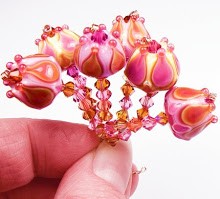
So I have gushed enough about these new colors and will just show off the beads I made by combining just these four, along with clear for encasing. These are called Desert Spice. I hope you love them too!

 So, I had planned on blogging about a completely different color scheme a couple of weeks ago. Then, my computer's new solid state hard drive took a complete dive and I lost all the pics and notes about the new Creation is Messy color I had tested the week before. Soooo, I'll have to redo that one!
 First up is Denim, which is aptly named, as it's a very dark, transparent grayish color that sits between green and blue. I personally prefer more of a blue cast to my denim, so I like to layer it with a bluer opaque color. This time, I used CiM Blue Steel as the opaque to layer Denim with, which turned out a little more grey than I was hoping for, but still bluer than when Denim is used alone. It's still really pretty, especially if you like those dark futuristic neutrals as much as I do.

 Denim is a nice smooth glass to work with. It didn't shock, pit, bleed or bubble at all, and it's not too stiff for layering - which is really nice! I actually really loved how it melted in when placed on top of the Blue Steel, on clear-encased black (below) - it created very crisp flowers.
 Next we have a pale tint called Bashful, which reminds me of sepia tones without the yellow. CiM calls this a pale purple - which personally, I just don't see. I see a very pale grey/brown that reminds me of the color of champagne, or black diamond crystals. It's however not as dark as CiM Chateau.
 This is another glass that is almost problem-free. I only saw the tiniest amount of scumming if I heated the end of a stringer too long or too hot. As with most pale transparents, use a delicate hand when heating, and you'll be fine.




 Posts
Posts


