Click to see the auction!

 How sweet - I got another award from Saffie's Blog - this one is called the Kreativ Award - thanks so much!!

 My favorite blogger over at Entrecard is also another beadmaker and bead blogger. Her name is Jenelle, a.k.a. Sortafloweringdesigns, and her blog is called Glass Muse.

 Making beads in spring colors just seems right. Spring is nature's hopeful time when everything is new and bright....and we sure need that in this world right now. We got that hint of hope last week with the changing of our leaders in office, but for the rest of us regular folks, it's taking some time for spring's newness to come upon us.
 These rays of hope have been peeking through for me, thank goodness. The depression of this last winter is starting to lift. I'm not normally so depressed over the winter months, but this year was quite difficult for me, like it has been for many people.
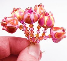
 Color always lifts my spirits, though. Playing with color and light seems appropriate this time of year, and pink always makes me smile. So I paired it here with that lovely green I captured in my last bead set to make beads in a classic spring scheme. I think these turned out really well.
 The set, called Strawberry Fairy, is playful and happy - something which I want to be right now. I almost always equate the pairing of green and pink with fairies. I'm not sure why - it's a feeling I get. That forest-y dew of the green with delicious, sweet pink makes me think of those pretty little nature spirits. It's hard to put into words. And the designs are fairy-like - with tiny flowers and dots and scrolling lines, these beads could almost be little fairy furniture.

 I finally got my butt back on the torch the other day, and let me say - it was so much fun! There's just something that happens to me when I pick out just the right glass colors to melt and layer together.
 I've done greens with purples many times before, but I have never combined these particular shades. The glass colors I used on this set are from CiM (Heffalump and Dirty Martini), Effetre (Dark Lavender, Dark Violet Transparent, Yellow Green and Sage Green Transparent) and Precision (Diamond Clear).
 Heffalump, Cim's lavender opaque glass, replaced my usual Effetre Pale Lavender. Heffalump is more vivid and has less of a tendency to fade than PL, and just glows under lights.
 I normally use a lighter shade than Effetre's Dark Violet Transparent (like, say, Ink Blue Violet), but with the Heffalump, it just sings. It's so deep I had to really layer it thinly, but encasing it with the Dark Lavender Effetre really helped bring out the color.


Hope, expectation, Bright promises.


 The richness of this color mirrors the complexity of the year, I think. And the deep, dark shade is akin to the scarier climate we find ourselves in. Leaky Pen is neither a true blue or a real green - which reminds me of the idea that we are in an ambiguous, ever-changing time in history. This color is still strikingly beautiful and reminds us of what a gift life is, even in the darkest, scariest of times.
 I've been working with Leaky Pen a lot since I wrote my first review of it over a year ago. I think my favorite color to pair Leaky Pen with is purple. That combination thrills me!


 Posts
All Comments