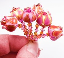
However, as many beadmakers know, the 104 COE line has no color that can be decisively called peach - in either opaque or transparent glass. The exception is Lauscha Peach, a light transparent which I don't really like using because it's very pale and doesn't translate to peach unless used alone.
So.... I had a challenge for myself - experiment with earth tones and layering to simulate a peach color. I found the solution after a lot of wasted glass and gnashing of teeth. CiM had come out with a new color recently called Adobe. It's a limited run (damn!!), and is described by CiM as an opaque brown.

There's absolutely nothing in this color that says "brown" to me. In rod form, it looks like some kind of bright caramel candy - or maybe a light, vivid terracotta. I didn't see peach at first, at all, so I waited awhile before trying it. When I finally melted it, it went much lighter. And when I tried layering it with a pale pinkish transparent, I got a warm, sweet peach color. Yey!!
 Peach is one of those colors that we beadmakers have been wishing, pleading, and begging for over the last decade. I don't know if anyone else knows that Adobe can translate to peach - but I do know that this color is extremely limited. Frantz only allows people to purchase 1/4lb at a time, and CiM has stated this is a limited run - so it's, well, limited. I only hope Kathy at CiM has her manufacturers make something similar to add to their basic line so we can have peach whenever we want.
Now, down to the knitty-gritty. Adobe is a joy to work with. It has a medium density - it doesn't wash out very much when layered, even against black, which is nice. I didn't have any problems with it bleeding or spreading out, or overtaking any other color.
I don't have photos of it used with the aqua colors when I made beads for my cousin last year, but I do have some more current photos. Here Adobe is layered with Effetre Rose Quartz, which is very very pale pink transparent - just enough to nudge the peach color out of the Adobe. The peach is paired with soft purple made of layers of Effetre Violet and CiM Purple Haze. Black is thrown in with clear for contrast. The effect is a sweet, springy combination.
Adobe acts like most opaque CiM colors - nice and stable, with a tiny bit of striation when left solid. It didn't burn easily, didn't pit and basically stayed put where I wanted it. Adobe is brightest when left raised - it warms up a little when melted in. Hope you like the pics - the beads are on Etsy if you're interested. :)


I love the color combination. Of course I am known for have a sense of color that is unusual.
ReplyDeleteIt works.
Another great test and beautiful beads. We sure need this color permanently in the palette. Pat
ReplyDeleteThis is very interesting. I have been using CIM sparingly without much success! I've had a lot of bleeding of the colors I've used and couldn't understand why this was happening. I'm relatively new at lampworking (<1 yr). I'm putting this link on my must read. Thank you.
ReplyDeleteThank you for this info. My original comment was lost after I signed in!!! I have only recently started to experiment with CIM and have not been real happy. I have also frequently experienced this bleeding out you speak of. I am a newbie to lampworking and intend to make your articles as must read. I love those aha moments.
ReplyDelete