Showing posts with label floral. Show all posts

Tuesday, January 7, 2014

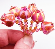
Bead of the Month Club - Floral Earring Beads

I just finished updating my website Lampwork.net...I'm doing a Bead of the Month Club.  It's for earring beads in flower designs.  I'm excited because I have never offered anything like this before, and I think it will be a lot of fun.  Flowers are my favorite - and a favorite of many of my customers!

Last year I had several people ask me about earring pairs.  People wondered why I don't offer them more often, and why my sets don't include matching beads for them to make earrings.  I vowed to try and fill that request - and I think this is a great way to do it.

Each month I will make up a batch of flower beads in a great color scheme inspired by the season.  Some months they will be raised flowers, some months they will be surface flowers - etc., etc. 

Customers who sign up will also get a matching pair of lampwork spacers, and a little surprise - crystals, or silver beads, or findings, or....?  The price also includes shipping!

Unlike most clubs like this, there won't be any commitment - people can buy one month and cancel if they want to.  Or, they can buy several months up front and save a little bit of money (there's a discount for the 3 month and 6 month subscriptions).  It will all be handled by PayPal's subscriptions, which makes it easy for me and for the customer.

More information about the Club is on my website - just click the pic below to go there. I hope you will check it out!  :)

lampwork bead of the month club


Tuesday, June 14, 2011

Transparent Glass; Simple Can Be Beautiful

I sometimes get caught up in creating complex color schemes using layers of glass to create new shades. I spend lots of time pairing colors to see how they make me feel, and to get that one perfect purple/green/pink/aqua, etc. I love doing that - it feeds my creative soul. I get lost in the color schemes, spending more time figuring out which glasses to use than actually making the beads.

Recently, though, I've felt the need for something simpler. Something purely basic and easy on the eyes. Maybe it's that my creative muse is a bit weary these days, I don't know.

I've been inspired lately by the weak sunshine we've had - those somewhat sunny but still cool days that peek out during the springtime here in the Northwest. That subtle sunshine can be made even more beautiful when seen through transparent glass colors - rich purples, soft pinks, vivid greens, honeyed ambers and sparkling aquas. Without any opaque backgrounds to block the light, these transparent shades twinkle in the sun, bringing about feelings of summer warmth and cheeriness.

Made in 2006 with Czech Tobacco (I think) and Effetre Ink Blue Violet

It's been a long time since I made transparent flower buttons. I did a few several years ago as an experiment, and they were really pretty. Back then I was kind of all over the place creatively, so I moved on to other designs without really exploring the transparent nature of these beauties.

This last couple of weeks I have had occasion to make more, and they really can be addictive. I've been basing my bead designs to match the flowers I've been making - sort of letting the colors choose themselves by pairing transparents in pleasing combos that would look good in the sun.

Effetre Lt & Med Topaz and Vet. Light Violet
Shank on back
I've refined the design a little bit - but they are essentially the same kind of five-petaled flower that lives in my mind as a sublime shape.  It doesn't have much basis in nature - I don't model my florals after any specific type I see outside - but more after an artistic version I see in my head. 


Greens Eff. Olive and CiM Mojito
Here are a few examples of flowers I made last week, in colors that just sing to me. Below, a wonderful berry pink emerges with some layering or light and dark transparents. These are little - under 1" in diameter, with 1/16" holes through the back.

Pink is Vet. Rubino layered with Eff. Rosatto
At first I stuck with the same shape, but then decided to change it up a bit with some indented petals.  I also flattened the shank in later versions to allow for easier placement in  jewelry designs. The shapes don't look as pretty in two dimensional images as they do in the hand, but you can get the idea. :)

Eff. Olive, Dk Lavender, Vet. Rubino


CiM Mojito, Vet Lt. Violet and DH Lt Aurae

Flattened shank
Eff. Ink Blue, Dk.Lavender, Olive & Mojito
All of these have sold from my Etsy shop, but I have even more flowers made and ready to be cleaned.  This time I worked in bright aquas and lime greens.  They'll be up sometime this week. :)

Saturday, August 29, 2009

Win a Tutorial!


Lori Greenberg is having a contest over on her blog to win one of my tutorials! She interviewed me last week on Beadnerd and decided to review the Raised Flower tutorial and have a giveaway. Take a look at her blog over on Beadnerd - it's a wonderful business blog for artists. Her personal beadmaking blog is great too! Thanks Lori!

Saturday, July 11, 2009

Comfort Beads

It's hot. That's not all that surprising given the fact that it's July, and in Washington that's essentially one of two or three months where we get hot weather here. I hate it though - who can make beads in this kind of heat? Man, I feel for people in places like Florida. Except maybe they like the heat, I dunno. Certainly the people who are going to the ISGB Gathering this year will have to deal with it! Not me. :)

Why am I talking about the weather? Well, weather can really effect my creative motivations. When it's hot like this, I barely want to think or move, let alone fire up the torch and create something pretty.

Soooo, I tend to fall back on colors and glass which are comfortable and familiar to me. Glass that I can practically manipulate and work on with my eyes closed. (Not really, Mom!! Metaphorically, of course.) And in the case of yesterday....that means pink and black! (I mean, really - did you expect any other color?)

The nice thing about these beads is that I added a little bit of spice in the form of metallic accents using a reduction color called Iris Blue. Iris Blue is a Reichenbach color that reduces a lovely metallic oil-slick sheen that goes well with the pink and black in these beads. It looks bright blue in the rod, but once you turn down the oxygen and bathe the bead in a little propane flame, you get that lovely silver.

The pinks are of course the usual suspects (see my auction for the list), so I had a fun time at the torch without having to plunge too many mistakes in the old water jar. Ahhhh pink. I love it!

I also got lucky and turned out some matching pairs for those people who have been asking for them for earring making. Matching pairs are sometimes hard - I can never get the sizes as exact as I want them to be. But this time, I got three pairs out of the deal, so those are in with the set. (not in addition to - there are 27 beads total, including the spacers).

These are on ebay tonight!

Sunday, June 7, 2009

Some Colors of Summer

A nice little heat wave passed through our way last week (and by nice I mean kill me now), and it kept me in mind of those effervescent, summery colors of lime and sky blue. So I made more of these beads in my "Water Girl" scheme and threw them up on ebay this afternoon.

Colors like these make me think of island beaches and oasis pools at night with sparkly water and shimmering stars. And most of all, cool air. Oh, blessed cool air! lol

It finally cooled off yesterday and actually even rained and thundered a little bit.

At any rate, I love these colors and how cheerful they are in the heat of summer. The black base and clear encasing bring out the saturation of the colors a bit, and made them a little tough to photograph, but I think I got them okay. Click the pics to see the auction - more pics are there on ebay.

Thursday, May 14, 2009

Too Dark For Summer?

I just pulled these lovlies out of the kiln this morning, and was a tad surprised to see how dark the colors turned out to be. Normally in the summer I like to work a little lighter. I still like the color combo though - so I listed them on ebay. What do you think? Take the poll below! :)


What do you think of the color scheme on these beads?

View Results
Create a Blog Poll

Sunday, March 29, 2009

What I am working on these days...

I have been uncharacteristically quiet in the beadmaking community and on my websites lately, so I thought I would write up a quick update. I am still alive, I promise!

These days I have been making progress (slowly but surely) on a new tutorial. Several people have asked over the last few months if I would put out tutorial on raised flowers. I did have a very simple set of instructions up on my website for awhile, but I knew those weren't in depth enough and didn't answer everyone's questions. So I pulled that down and reworded it - adding much more information and lots of action pictures. I am also expanding it a bit to add in some info on alternative designs and possibly some stuff on color.


It's about halfway done now, so I am hoping to speed it along to the finish line really soon.

It's been a tough few months for me lately, so that's why I have been working so slowly on this and why I have been so quiet. There's a good possibility I will be taking an extended break from making and selling beads, but we'll have to see how that turns out soon. For now, I am hoping to have this tutorial available for purchase on Coloraddiction within a week or two.

(((((hugs))))) to all! :)

Monday, March 2, 2009

Why Pink?

These past years that I have spent learning to make beads and falling in love with the process, I somehow became known in my little corner of the beadmaking world as the queen of pink glass (and other pink names). I sometimes have felt almost like a "pink pusher" or drug dealer of sorts when it comes to pink glass - especially the odd lots.


So why is it that I became known that way, and why do I love pink so darn much? I mean, I don't wear a lot of pink. I don't have a lot of pink decor in my house (much to the relief of my husband). However, I absolutely cannot get enough pink glass, and I have a soft spot for any bead, yarn, paper, or craft of any kind that uses pink.


For me, it's not as much about pink as a solid color - it's the pink spectrum of colors, and pink paired with other colors that gets me excited. Show me something that is verigated pinks with maybe some coral, orange and cream thrown in and I just bliss out. Pair pink with deep brown or khaki green and I am in love.

It's not that I love pink with everything - there are some colors which I cannot pair pink with. I dislike pinks and blues used together, and this includes aquas and teals, too. And pink and purple? Only once in awhile can I accept something so incredibly girly. :)

I honestly don't know what the deal is with me and pink. I was never a lover of pink as a child or teenager - I liked jewel tones and vivid oranges, yellows and purples as a kid. My fair skin and reddish hair do not make a good base for pink clothing, so I didn't wear it all that often, unless it was with white in spring, as a print or something.

But pink beads? Oh, yeah. I'll wear those any day. Maybe the little girl in me is finally making herself known and wants to paint everything cheerful shades of rose and fuchsia. Who knows? I'm just glad I have a wonderful medium to use to express my love of all things pink.

Thursday, February 19, 2009

What's Coming Up


So I've been working on the next installment of my Glass Color Families tutorial series for quite awhile now. I'm finally almost dine, so I thought I would post a little announcement with a teaser picture. Yes, Pinks!!

The tutorial will be listed on Etsy as well as my main Coloraddiction tutorials site hopefully by the beginning of next week or sooner. This is a pic of all the petals I have pulled for the tutorial - each of the petals is a glass color I will be covering in the tutorial.

They are all 104 COE glass from CiM, Effetre, Reichenbach or Vetrofond. Some will be covered in more detail than others, but there will be blurbs on all of them. I will also be covering some techniques that are related to the pink glass.

The tutorial is geared towards the novice beadmaker, but is useful for a range of skills from beginner to advanced.

I'm not sure yet what the price of the tutorial will be, but it will be larger than my Browns tutorial, so might be a little more than that was. Anyway - hope you all will stay tuned! If you want to, you can sign up for the mailing list on Coloraddiction - I will be announcing the tutorial there when it's released.

Thursday, February 12, 2009

When Color is...Well...Weird

One of the most challenging, and well, the most fun, aspects of working with glass is that there are a lot of times when what you pull out of the kiln the next day is completely different from what you put in the night before.

No, I don't mean that my beads are shape-shifters...I mean when it comes to the colors of the glass I use. :)
The chemical properties of glass are such that in many of the colors there is the tendency for changes to happen in the flame and even in the kiln as the glass is heated, cooled and annealed over time.

This happened to me yesterday, and when I opened the kiln this morning to look at my creations (this is a lot like Christmas morning, let me tell you) I was slightly shocked and had to stand there for a minute in the freezing garage studio peering at the color of the beads.
See - the rods I used were meant to give me a much lighter, cooler color scheme - more lavender, more pale, creamy yellow and less deep, caramel tones and a lot less pink.


That's not to say I am unhappy - in fact, I love the way these turned out! It just goes to show you that sometimes the glass has a mind of its own and will not conform to your preconceived notion of what it should look like when cool.
Color is sometimes best when it's completely unexpected - that's when I fall in love the hardest.


This set, which I am calling Opal Kiss, was made from the following colors - Precision Diamond Clear, ASK 104 Caramel Apple (for the metallic gold effect), CiM Heffalump and Pink Champagne, and Effetre Rosatto, Opal Yellow and Pale Topaz.
I believe some of the darker effects came from the Caramel Apple reacting with some of the other colors. Caramel Apple is a very reactive color and reduces a pretty metallic gold. I think the dark lines appeared when it touched some of the darker transparent colors such as Pink Champagne.
Anyway - enough of the technical stuff - they just turned out pretty, and I am not sure I could duplicate the effect on some of them if I tried to. So, they're on auction!

Sunday, February 8, 2009

Colors Remind Me of People, Or

People remind me of colors....

Often when I am working on choosing colors for a bead set, my brain is busy thinking about random stuff as well (multitasking?). Sometimes, a person comes to mind, and I end up picking colors that remind me of that person without even realizing it until later.


In this case, it was my mom Karla, and this is the set that came out of the kiln this morning.

My mom is a beautiful person, with a classic and comfortable style - kind of like these colors. The sweet, earthy berries and effervescent limes remind me a lot of her personality.


Mom's kind of complex, too - while on one hand she is familiar and warm, she is also bright and quietly cheerful, and I love her!

Karla's Garden beads were made from CiM glass in Heffalump, Dirty Martini, Simply Berry, Effetre glass in Grass Green, Olive, and Precision glass in Diamond Clear.

Even the glass names remind me of my mom! How weird is that? What colors remind you of your mom?

These beads are of course on auction - click them to see!