Showing posts with label etsy. Show all posts

Wednesday, April 18, 2018

Glass Testing: CiM 555 Sacre Bleu Ltd. Run

Hey, everyone! Today's new color test is of Creation is Messy's latest blue - a transparent bright cobalt called Sacre Bleu. This vivid shade is actually a very easy glass to work with, if a bit tough to capture in a picture. It's very intense - even more so than Effetre Intense Blue or CiM's other cobalt blues called Neon Blue and Royal.

Sacre Bleu is probably closest to Royal, in my opinion, but if you put all four rod colors together, you might have a hard time telling the difference. It's a bit lighter and less intense than Effetre's long-standing basic Cobalt glass.

Sacre Bleu was very easy to use - only slightly stiff, but melts smoothly and evenly. It layers extremely well, with no feathering, bleeding, spreading, pitting, etc. I also didn't have any problems with the rods shocking.

I had fun layering this gorgeous blue on top of Effetre Periwinkle, thus lightening it up a bit while keeping the lovely saturation of color. Layering was easy, since Periwinkle is not as stiff as it's CiM counterpart Grumpy Bear. But you can probably use that in place of Periwinkle and not see much difference.

Sacre Bleu is an easy glass to use and love, but it is a bit hard to photograph. Like all cobalt shades, this one shows up lighter and less intense in pictures, and it takes some photo-editing to get it even close to the vivid deep shade of blue it is in real life. This is as close as I could get!

Here's a set of big hole beads I made with these colors, paired up with some saturated purples for an intense, summery effect. 

These beads are now available in my newly re-opened Etsy store!


Tuesday, September 1, 2015

Beadmaking Tutorials Sale and Retirement!


I am retiring my beadmaking tutorials! All tutorials will be 25% off until Sunday September 6th - then they will be gone forever! Get them now while you still can.

Go to my Etsy store and enter coupon code ETSYRETIRE to get your 25% off discount.


Of course I will still be posting here on this blog when I have glassy things to talk about. :)

Thursday, May 23, 2013

Cim Glass Testing: 419 Iguana Ltd. Run, 421 Green Tea Ltd. Run, and 516 Mediterranean Ltd. Run

Let me just preface this post by saying AAAARGH!  I have never had a tougher time photographing a color scheme.  My camera hated these colors, so I imagine they might look slightly different on your monitor that they do in life.  However, know that I tried very hard to get these to look right, I promise.

All three of these colors are very pretty in reality - maybe better than what you can see in the pics. Maybe I need a new photography set up!

An observation: Creation is Messy seems to like making green.  They have a lot of shades of green.  All of them are different - and if you count the limited runs and discontinued shades, you have quite the selection.  I imagine its because they are constantly trying new formulas and end up with a lot of colors they can't recreate.  Personally, I really love this.  It means we will never have to worry about not having the right green!  Now, if they would only do this with pinks, I would be even happier. :)


First, we have the opaque color - Iguana.  This is the color that
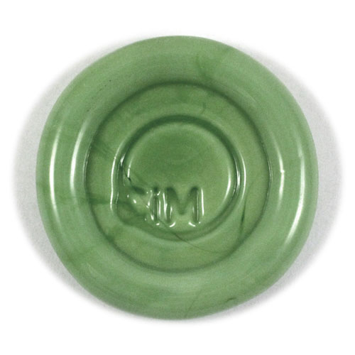
CiM's pic of Iguana. What the...?
really flumoxed my camera.  I think that may be why the color pictured on CiM's website is somewhat different from the color I actually received to test - it's just not a color that photgraphs well. Iguana on CiM's site appears to me to be a lot greyer and more subtle than the bright jungle green I got. The rod I had seems to be a kind of opaque peridot shade - a nice springy green.  Slightly lighter and bluer than CiM Elphaba.  More along the lines of Effetre Grasshopper, but not quite as blue.  Confused?  Yeah, me too.  :)

*Note - after seeing my post, Kathy at CiM says she will likely re-take the picture of the Iguana paddle above to reflect a more accurate color. :)*


Iguana behaves like most other greens in CiM's line. Better behaved than Effetre's opaque greens - but still does striate, bleed and feather just a tiny bit.  If you're careful not to overheat it, it can be a great layering color - especially with the lighter transparents. Just make sure it's completely covered with any encasing that you do or it might bleed a little out from under the clear or transparent color.

Iguana has a decent amount of density, and does not fade under layers.  It retains its bright color even under a thick layer of clear.  It works very nicely - not too stiff and not too soft. When used as a base, I was able to melt in decoration without much trouble or reaction, other than the slight striating lines that most greens have.

I really like this shade of green - I just wished it photographed better.  I really had to finesse the color out with my editing software, and even that didn't come out exactly right. You might just have to try it for yourself to see its full beauty! Iguana will be available in June.


Next we have the transparent Green Tea - which pairs perfectly with Iguana.  At first, I thought this color might be a dead ringer for Appletini.  However, Green Tea is slightly more saturated than Appletini. I would maybe compare it to Effetre Pale Emerald, but more saturated and a little more yellow.

Again, my camera had a hard time picking up the intensity of this color. I had to edit the crap out of it, and it's still not quite right.

If you are familiar with Swarovski, this color matches their Peridot pretty much right on. This makes Green Tea a great addition to the palette, because in my experience, all other light greens are just slightly off from Peridot.  I love that this matches right on, because Peridot is one of my very favorite Swarovski colors.

Green Tea is an easy color to use.  No reactions, a decent stiffness, without being too stiff, and not much bubbling or scumming at all. Its only problem seems to be that it hates being photographed. At least by me.  :)

I loved using this as the companion to Iguana - the pair makes a gorgeous spring green that makes me think of freshly cut flowers and sunny days. Available in June.


The next color - Mediterranean -  is one of my new CiM favorites - which is no surprise, given that it is a lighter version (to me anyway) of my favorite CiM color - Leaky Pen.  Mediterranean is described on CiM's website as a transparent denim blue.  For me, it's really more of a teal blue.  Denim in reality has more blue and less green than this color.  But that's just me being picky.

*Note: after seeing this post, Kathy at CiM changed their description of this color to teal blue instead of denim. So nice!*

Mediterranean is a very similar shade to Leaky Pen - just a lighter version.  That makes it nicer for layering, and brings out the beauty of the color. You can use this color as a thicker decoration - but it's still a little too dark to be used as a base alone, without encasing it.

It is somewhat stiff - not as bad as some dark transparents, but enough to make working it somewhat of a challenge.  I was able to manipulate it, though - it just takes a little extra time.

In these beads, Mediterranean is layered with Vetrofind Pajama Blue - a very subtle pale aqua. I am not sure this color can be found anymore, but you can use any of the other aqua opaques that are out there just as well.

I didn't have any trouble with scumming and bubbling in this glass, but it does need slightly more heat to melt fast.  Use care when layering - balance the heat so your opaque doesn't melt too quickly and overtake the Mediterranean.

Mediterranean makes gorgeous encased stringer - lighter than Leaky Pen, but so pretty when used over a pale aqua.  Yum!  It's available now - I got mine from Frantz Art Glass.

The clear used in these beads is Double Helix Aether. I did have one bead crack, but I think it was more user error than anything else - but I wanted to mention it just in case.

One last note - I went ahead and sold my soul to the devil.....uh, I mean....joined Pinterest. Come on over to see what I am pinning. Goddess help me.  :D

The beads shown in this post are called Seattle Spring, and are available for purchase in my Etsy store.


Friday, August 5, 2011

CiM Glass Testing: A Bunch of Opals

I spent this week with some newer colors (new to me anyway) .....with some interesting, fun and somewhat frustrating results.

I decided to do all 4 of these colors in one post - mostly because all four of them make kind of a tiny spectrum of aquas and teals that all look good together. Also, they all acted very similarly in the flame and in front of the camera.

I'll go through them one by one, and then do some comparisons. One thing to keep in mind as you look at the pics (and this is the frustrating part)....all of these colors were very, very hard to photograph.  They tend to look a bit washed out and dirty in most pictures...which I suspect has something to do with the translucency.  Looking at the colors on the CiM website, I see I am not alone on this issue. In real life, all four of these colors are more saturated than can be shown here.

The first is 547 Electric Avenue - a color that has been around since pretty much the beginning of CiM.  It's classified as an Opal, which means it has a translucent, almost glowing quality.  CiM Opals can be compared to Effetre Opalinos and Alabasters - but in looks only.

In my experience, CiM's Opals are much less shocky and picky than their Effetre counterparts, and more compatible, thank goodness!  Electric Avenue in particular was really easy to work with.  It maintained its translucency for the most part, and seems to be compatible with clear and black as well as the opaque Effetre Light Turquoise I layered it with.

By itself, in spacers, Electric Avenue is a vivid, opalescent aqua shade, which is slightly lighter than it is in rod form. It tended to go more opaque when worked longer.

I played with the functionality of all 4 Opals, sometimes using them as an opaque base, and sometimes using them in place of a transparent, in layering.  

Electric Avenue encased well as a base with clear, and turned a bit opaque.  As plain stringer, it stayed opalescent. When used as an opaque flower petal base, it went slightly opaque, but you can almost still see the black bead underneath.  However, when layered on top of Effetre Light Turquoise, as seen here in the left floral, and underneath a dot of clear, it went a nice transparent light aqua.  Interesting!  I liked this color - easy to work with, not a lot of bubbling or burning, a nice soft consistency and a lovely color.  Now if I can just get the song out of my head!

Next we have 598 Atlantis, a teal blue Opal that reminds me a little of the color Mermaid.  Atlantis is very similar to Electric Avenue in consistency and workability.

As spacers, this color tended to vary in opacity a lot more - it was hard to actually make two alike!  There is some streaking in some of the more opaque spots.

One major difference between the two colors is that Atlantis seems to be a bit more sensitive to temperature.  It was the only color to crack under a layer of encasing - but only on one of the beads I made this week. The crack along the hole is thermal, which means that it most likely got too cold as I worked it.  It seems that the longer this color is worked, the more opaque it gets, so keep an eye on that heat if the color solidifies!

I tried the floral experiment on Atlantis, as I did on Electric Avenue above, with similar results. The flower on the right appears very translucent because there is no layer of opaque Light Turquoise.  I think it's a really pretty effect.  Atlantis stayed dark when layering, but still acted like a transparent when I needed it to, as on the left floral here, sandwiched between the Light turquoise and the clear.


Moving on, we have 499 Rainforest, a teal green opal. Again, the consistency and workability were very similar to the other opals I have covered in this post.  Pretty much everything about Rainforest is the same as its sister color Atlantis, with the exception of hue.  No shockiness, no bubbling or scumming, a soft, buttery melt and a lovely vivid color. 

One small difference is that Rainforest doesn't go opaque quite as easily, and sometimes will only opacify in spots on the same bead (near the hole, most of the time) and stay translucent elsewhere. 

This Opal is the darkest of the four, although that is difficult to see in the photographs.  The stringer is especially dark and lovely (pics below).  No floral experiment with Rainforest - I suspected that the results would be very much like Atlantis.

The last of the four colors I tested this week is the newest one - 404 Jade Palace Ltd Run.  Jade Palace is the newest and lightest of these, and lands somewhere between light teal and seafoam green.

I also found that this color had just a tad more of a tendency to go opaque than the other three. It made strikingly lovely stringer, reminding me of jade gemstones.

Again with the floral experiment, with similar results.  Very glowy, translucent florals when no opaque is used, but very normal looking florals when Jade was layered.

Now, I saved the best part for last - a little bit of a surprise that happened when I experimented with using the Opals as transparent layers.

I love when my experiments yield happy results!  It turns out that all four of these colors tend to spread out when melted into the base bead - something I think probably happens with a lot of Opals. This makes them wonderful for dot distortion - just like Rubino Oro!  In these dot beads, I layered each Opal on top of Light Turquoise and then melted the dots all the way, creating some lovely shapes that fit together like puzzle pieces.  The dot distortion with these colors was really forgiving and easy.  Fun!

Last but not least, here are some pics of the beads I made this week with all four of these Opals, plus Light Turquoise, Black and Clear.  They are on Etsy. :)  Have a wonderful weekend everyone!

 

Tuesday, July 19, 2011

Beadmaking Tutorial Sale, and New Colors Coming Soon!

Okay, so usually when I do a tutorial sale (a few times a year) I do a buy-one-get-one-free kind of deal.  This sale is different.  Until midnight Friday night, all tutorials in my Etsy shop have been marked down by several dollars each.  There's no buying limit or minimum for this one.  This only counts for the Etsy store - the tutorials on Coloraddiction (the same ones) haven't been changed. That's because I don't want to change the PayPal buttons.  :)  So check out my Etsy store to see all 7 of my beadmaking tutorials on sale.

So....why the sale you ask?  Well, for a few different reasons.  First and most important - to help my current precarious financial situation. I won't lie - I am in a bit of a mess, and have been for awhile now.  Those who follow the blog know about the lawsuit, so I won't get into that except to say it's still going on.  We're struggling - like so many people out there - so every little bit helps.

Also, sales of tutorials have slowed a bit, and I want to give some extra incentive to get mine - which are great for newbies just getting into beadmaking, as well as intermediates who haven't run across my work until now.

Third, I am thinking of retiring a few of the older ones, so they will likely be disappearing after this sale is over. 

Will I be doing any new tutorials?  The answer to that is probably not for awhile.  I am a bit burned out on them and want to focus more on beadmaking.  Plus, I have run out of ideas.  :)

In other news - there are new CiM colors out to test, so look for new posts on those very soon.  CiM has made some gorgeous new greys that I am excited to try, as well as some opals that I really need to experiment with.  CiM has been releasing a lot more colors lately in their new Ltd Run category, and those will be fun to test.  I sure hope they continue to release colors which will be in their permanent line-up!

That's it for now - I hope everyone stays cool and has a fun summer!

Wednesday, April 20, 2011

Evidently I Have Broken My Blog :)

So, it was recently brought to my attention that the comment form has disappeared on some of my posts - especially the newer ones. So that last post asking you all to let me know what you think about a new tutorial was kind of pointless!  LOL

 I think I know how I can fix it, but it will take some changes to the look of the blog and such, so please bear with me as I mess with the settings and html file.

In the meantime, I just listed a bunch of small sets over in my Etsy store if you want to browse.  Here are some pics - click on them to go see.