Showing posts with label vetrofond. Show all posts

Saturday, September 13, 2014

Glass Beadmaking: Absence of Color - Focusing on Design

This time of year, I usually start making beads in fall colors - purples, ambers, oranges, greens, browns, etc. For some reason this year, I remain sort of uninspired.  Maybe it's the weather (which has been uncharacteristically warm in the Northwest this year). Maybe it's the stress. Who knows. So, I decided to take the color out of the equation this week and just work with black and white. 
Glass used: Vetrofond Black, Effetre White and Double Helix Aether.
Working with black and white is fun because the stability of the glass I use allows me to go crazy with stacking, masking, raking and twisting, and still end up with crisp, clear designs on the beads.
My favorite bead uses encased white stringer with masked black and white dots.

For black, I primarily use Vetrofond Black. It's sad, though, because it's been discontinued and I can't find it anywhere anymore.  I am down to my last two rods (!!)  I am hoping that CiM Hades will work in its place, but we'll have to see.

For those who are unaware, all black glass is not alike.  The reason why is that black is not an opaque color - it's a very, very dark transparent color, technically speaking.  Effetre Black, which I think is the most commonly used black glass out there (in beadmaking anyway), is really just a super dark transparent plum/purple. It's not dark enough to prevent it from bleeding into other colors, though, and that's most evident when you use it with white.  Lines are not as crisp, and you can see a slight purpling of the edges of the white when both are layered together.

Most other black glasses I have used have similar issues. They either spread, feather or discolor any pale opaque color used with them.

Some black glasses are actually made that way on purpose (Effetre Intense Black for instance). Some beadmakers are very adept at using that property to their advantage when making beads with organic, freeform designs.

Vetrofond Black is great, because it is based in blue and not purple, and it seems to be darker and to have more stability.  So the lines are really crisp, and there is very little bleeding.

CiM has several black glasses, and I have read that Hades is the best when it comes to stability and darkness.  Yey!  In the meantime, I am going to keep my eye out for stashes of Vetrofond Black.

Beads with designs close to the holes
I got a lot of joy making black and white beads this week.  I think my designs have gotten more intricate over the years, and my beads have gotten slightly smaller.  I really love tiny intricate work!

 I've also been focusing on asymmetry - making the designs pull focus toward the hole and not toward the center of the bead. Just for fun and visual interest.

Next week, it's back to fall colors, I think.  I really do love autumn, so hopefully inspiration will find its way back to me. :)

These are all available on my website of you're interested.


Thursday, May 23, 2013

Cim Glass Testing: 419 Iguana Ltd. Run, 421 Green Tea Ltd. Run, and 516 Mediterranean Ltd. Run

Let me just preface this post by saying AAAARGH!  I have never had a tougher time photographing a color scheme.  My camera hated these colors, so I imagine they might look slightly different on your monitor that they do in life.  However, know that I tried very hard to get these to look right, I promise.

All three of these colors are very pretty in reality - maybe better than what you can see in the pics. Maybe I need a new photography set up!

An observation: Creation is Messy seems to like making green.  They have a lot of shades of green.  All of them are different - and if you count the limited runs and discontinued shades, you have quite the selection.  I imagine its because they are constantly trying new formulas and end up with a lot of colors they can't recreate.  Personally, I really love this.  It means we will never have to worry about not having the right green!  Now, if they would only do this with pinks, I would be even happier. :)


First, we have the opaque color - Iguana.  This is the color that
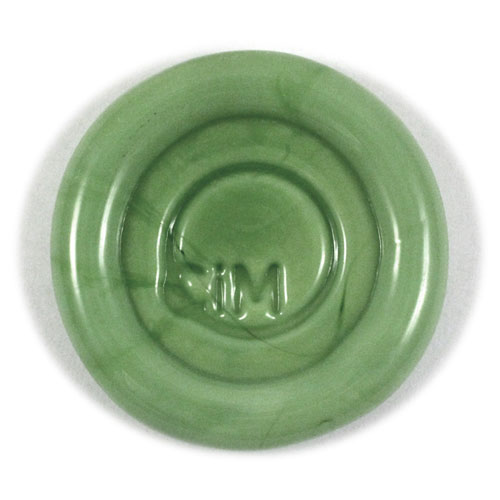
CiM's pic of Iguana. What the...?
really flumoxed my camera.  I think that may be why the color pictured on CiM's website is somewhat different from the color I actually received to test - it's just not a color that photgraphs well. Iguana on CiM's site appears to me to be a lot greyer and more subtle than the bright jungle green I got. The rod I had seems to be a kind of opaque peridot shade - a nice springy green.  Slightly lighter and bluer than CiM Elphaba.  More along the lines of Effetre Grasshopper, but not quite as blue.  Confused?  Yeah, me too.  :)

*Note - after seeing my post, Kathy at CiM says she will likely re-take the picture of the Iguana paddle above to reflect a more accurate color. :)*


Iguana behaves like most other greens in CiM's line. Better behaved than Effetre's opaque greens - but still does striate, bleed and feather just a tiny bit.  If you're careful not to overheat it, it can be a great layering color - especially with the lighter transparents. Just make sure it's completely covered with any encasing that you do or it might bleed a little out from under the clear or transparent color.

Iguana has a decent amount of density, and does not fade under layers.  It retains its bright color even under a thick layer of clear.  It works very nicely - not too stiff and not too soft. When used as a base, I was able to melt in decoration without much trouble or reaction, other than the slight striating lines that most greens have.

I really like this shade of green - I just wished it photographed better.  I really had to finesse the color out with my editing software, and even that didn't come out exactly right. You might just have to try it for yourself to see its full beauty! Iguana will be available in June.


Next we have the transparent Green Tea - which pairs perfectly with Iguana.  At first, I thought this color might be a dead ringer for Appletini.  However, Green Tea is slightly more saturated than Appletini. I would maybe compare it to Effetre Pale Emerald, but more saturated and a little more yellow.

Again, my camera had a hard time picking up the intensity of this color. I had to edit the crap out of it, and it's still not quite right.

If you are familiar with Swarovski, this color matches their Peridot pretty much right on. This makes Green Tea a great addition to the palette, because in my experience, all other light greens are just slightly off from Peridot.  I love that this matches right on, because Peridot is one of my very favorite Swarovski colors.

Green Tea is an easy color to use.  No reactions, a decent stiffness, without being too stiff, and not much bubbling or scumming at all. Its only problem seems to be that it hates being photographed. At least by me.  :)

I loved using this as the companion to Iguana - the pair makes a gorgeous spring green that makes me think of freshly cut flowers and sunny days. Available in June.


The next color - Mediterranean -  is one of my new CiM favorites - which is no surprise, given that it is a lighter version (to me anyway) of my favorite CiM color - Leaky Pen.  Mediterranean is described on CiM's website as a transparent denim blue.  For me, it's really more of a teal blue.  Denim in reality has more blue and less green than this color.  But that's just me being picky.

*Note: after seeing this post, Kathy at CiM changed their description of this color to teal blue instead of denim. So nice!*

Mediterranean is a very similar shade to Leaky Pen - just a lighter version.  That makes it nicer for layering, and brings out the beauty of the color. You can use this color as a thicker decoration - but it's still a little too dark to be used as a base alone, without encasing it.

It is somewhat stiff - not as bad as some dark transparents, but enough to make working it somewhat of a challenge.  I was able to manipulate it, though - it just takes a little extra time.

In these beads, Mediterranean is layered with Vetrofind Pajama Blue - a very subtle pale aqua. I am not sure this color can be found anymore, but you can use any of the other aqua opaques that are out there just as well.

I didn't have any trouble with scumming and bubbling in this glass, but it does need slightly more heat to melt fast.  Use care when layering - balance the heat so your opaque doesn't melt too quickly and overtake the Mediterranean.

Mediterranean makes gorgeous encased stringer - lighter than Leaky Pen, but so pretty when used over a pale aqua.  Yum!  It's available now - I got mine from Frantz Art Glass.

The clear used in these beads is Double Helix Aether. I did have one bead crack, but I think it was more user error than anything else - but I wanted to mention it just in case.

One last note - I went ahead and sold my soul to the devil.....uh, I mean....joined Pinterest. Come on over to see what I am pinning. Goddess help me.  :D

The beads shown in this post are called Seattle Spring, and are available for purchase in my Etsy store.



Thursday, February 19, 2009

What's Coming Up


So I've been working on the next installment of my Glass Color Families tutorial series for quite awhile now. I'm finally almost dine, so I thought I would post a little announcement with a teaser picture. Yes, Pinks!!

The tutorial will be listed on Etsy as well as my main Coloraddiction tutorials site hopefully by the beginning of next week or sooner. This is a pic of all the petals I have pulled for the tutorial - each of the petals is a glass color I will be covering in the tutorial.

They are all 104 COE glass from CiM, Effetre, Reichenbach or Vetrofond. Some will be covered in more detail than others, but there will be blurbs on all of them. I will also be covering some techniques that are related to the pink glass.

The tutorial is geared towards the novice beadmaker, but is useful for a range of skills from beginner to advanced.

I'm not sure yet what the price of the tutorial will be, but it will be larger than my Browns tutorial, so might be a little more than that was. Anyway - hope you all will stay tuned! If you want to, you can sign up for the mailing list on Coloraddiction - I will be announcing the tutorial there when it's released.

Thursday, December 18, 2008

Color Comparisons: Transparent Pinks

Those who know me, know that I am absolutely ga-ga for pink glass. Pink anything, really. I'm addicted to pinks more than I am addicted to any color, and that's saying something!! So when a few new pink shades came out recently, I took some time out to test them and get some first impressions, and to compare them to some of the old standbys. (Standbyes? Standby's? Standbies?) I haven't had much time to do any in depth testing, but I have melted the new colors enough to Fall In Love.

The colors I will be looking at in this post are all transparent pink shades in the medium to very light variations. They are: CiM 915 Pink Champagne, Effetre 067 Rose Quartz, Effetre 082 Lavender Blue (aka Rosatto), Effetre 068 Pink and Effetre 082-A Amber Rose Odd.

You can see the color differences in this Pink Wheel. While I tried really hard to get the colors right in the image, please note that colors may not appear exact on every monitor. And the palest color, Rose Quartz, appears really washed out here.


So first, I want to talk about the new Effetre Rose Quartz. This came out a couple of months ago, when Mike Frantz was going to send it back until someone talked him out of it. (Rumor of course!) I think he just thought it was a lighter version of Effetre's regular transparent pink - also shown in the wheel.


Not true! Rose Quartz and Pink are very different in my view. Effetre 068 Pink is much peachier in comparison. Rose Quartz is a very cool, pale baby pink. I would classify it as a tint - it's so light. The rods look almost clear unless you look at the ends - that's where you see the most color. Rose Quartz has replaced 082 Rosatto for me as a layering pale pink - for one very big reason. More on that later. RQ makes wonderful layering over Rubino and the various shades of opaque pink. I've been using it a lot these past few weeks. It's clarity is nice, it's got a medium amount of stiffness, and it encases well. Plus - it's baby freakin' pink!!

068 Effetre Pink is the classic oldie of this bunch - it's been around forever. However, I rarely use it these days, because it just isn't pink to me. It's peach - granted, a pale, cool peach. Vetrofond came out with its version of Pink a few years ago, and I liked it because it was slightly less peach. I didn't have any to compare for this post though, because I had been using 082 Rosatto for so long.

082 Rosatto was my favorite for a long time, when it came to transparent pinks. It's official name, Lavender Blue, is really weird, since it's not blue at all. It does, however, shine a tiny bit lavender-y when under fluorescent lights. This is why I was so happy when Rose Quartz came out.


But Rosatto is a really pretty color - slightly darker and more lavender than RQ, and great for layering as well. It's perfect for really berry-shaded purples and pinks in layering. But for true pink, I love the RQ.


I threw Amber Rose into this party just so you could see another medium shade - this one much peachier and warmer than pink. In fact, I wouldn't really call this pink at all - but a dirty pinkish amber color. This color is highly sought after, because of its rarity. It's not made anymore, but if you can find it, it's well worth the money. The color is strikingly strange, and makes really gorgeous organic bead bases. I'm on my last rod, and I have no clue what I am going to do with it. Maybe hoard it forever!

Last but not least is the brand new CIM color Pink Champagne. Oh, my freaking YUM. This color is the darkest of the bunch, and delightfully weird. I would classify it as a medium orchid pink with lavender undertones. By itself, it makes absolutely stunning spacers. As a layering color, it's perfect! It also makes the most gorgeous floral petals when combined with opaque Dark Raspberry Pink (also a rare odd that I am quickly running out of!).

Pink Champagne reminds me a lot of Rosatto, except darker and more "sparkly". Seriously, CIM's quality is really impressing me. This color of theirs has gorgeous clarity, a nice stiff consistency (but not Lauscha-stiff) and doesn't bubble or scum like most transparents. It is a tiny bit more sensitive to temperature change, and likes a hot flame emvironment, as far as I can see. And the color? Off the charts gorgeous. The 104 coe color line has a distinct lack of medium transparent pinks - and this color goes a long way towards filling that gap.

In this bead I started with Opaque Dark Raspberry Pink, encased it in Pink Champagne, then decorated it with clear scrolls.

So the new pinks - Pink Champagne and Rose Quartz - are right on the money as far as I am concerned. I sure hope both glass manufacturers keep them in the palette!

Fields of Joy, using Rose Quartz as the light transparent

Vetrofond must love orange....

So Vetrofond, our favorite Odd Lot glass maker, has come out with yet another huge assortment of weird colors for us to try out. This is what...the fifth batch? I do applaud them for listening to their customers and for really trying to put out new and inventive glass for us.

But enough with the orange filigrana, please!! :D I mean, have you SEEN the latest batch of odds? Almost all oranges and greens. And ALL filigrana - a dark color covered in a contrasting lighter color, for a marbled look.

I say that with love and hope that Vetrofond will soon hear me and come out with some great new opaque purples and pinks. Actual pinks. Not faded out pale translucent pinks. Stellar purples. Not greyed out, reactive purples.

It's true that Vetrofond is likely catering to those beadmakers who really love reactive glass - who adore making organic beads and messing with different metallic reactions. I guess I am just one of those rare glass-lovers that love plain, pure, stable colors that I can combine and layer without reactions.

Don't get me wrong - I do love reactions, sometimes. But not with every color.

We have enough of those now, I think. Double Helix, Vetrofond, ASK, Lauscha and other makers are really pumping out the silver based, filigrana, reactive, organic and weird. It's fun to experiment with them - to a point.

One other thing - if you've been buying all this new glass, you've probably realized by now that the paddle pics shown on the vendors web sites do not often relate to the real thing when you personally melt the glass. I've still not been able to get that sweet marbly pink and cream from Sweet Strawberry. Just a rusty, tomato red. Pink #3 Pastel was nothing but almost white for me. Orange Punch never looked like the paddle pic - it stayed a translucent red, no matter what I did. And the gorgeous Poppy? Hard to turn pink, like the paddle - mostly a luscious.....yep, you guessed it......orange. I am afraid to buy the brand new Jupiter - it looks so yummy in the paddle, but who knows if I will actually get that color for reals.

So.... Vetrofond? Please? A deep, vivid opaque purple. A bright opaque pink. A sweet opaque apricot or peach. Pretty please. And no more orange. For the love of GOD no more orange.

Rising Star: Vetrofond 942 Poppy (aka Watermelon) Odd


One of Vetrofond’s more recent Odd Lot selections, this color is….interesting. When I saw the picture of Poppy on Frantz Art Glass’s newsletter, I got excited. When I finally was able to order some, and saw the rod color for myself, my heart started pounding. Because - and I say this with the most maturity possible - OMG!!!! The rod color is just the most delicious shade of bright pinky-coral-glowy-juicy-watermelon imaginable.

If only the glass stayed that color when melted. **heartbreak**
Don’t get me wrong - this is still a lovely, cheerful color. But for the most part, it stays a bright coral orange, and loses a lot of its translucent pink quality. The color variances in this glass really depend on your ability to strike it. It’s VERY picky about temperature and timing.

This color reminds me a little bit of the first batch of ASK 104 Passionate Pink - back when that color first came out. Poppy shares that color’s way of responding to temperature.

The glass itself is somewhat stiff - and turns a weird sparkly grey in the flame. When you strike it, the surface can turn a murky orange brown - and that’s kind of what you’re looking for. The darker the bead when you put it into the kiln, the brighter orange you get when it comes out of the kiln. Most of the time. Did I mention this glass is really picky?

Encasing this color in any pale pink or clear transparent yields a pretty, pale creamsicle color. I love this, because you can’t get that pale of a color with most of your typical orange shades.
Poppy almost never comes out as a solid color after annealing. It usually has quite a few striations of color ranging from coral pink to sunshine orange on the same bead.

This is one of the only colors I have that I really wish would stay the same shade as the rod. Hopefully Vetrofond will figure out a way! But it’s still really lovely. Get some, especially if you love juicy summer colors.