
I got this idea from the BeadedLily's Sketchbook blog - sounds like a fun meme!
THE RULES:
Rules of the meme: Respond and rework. Answer the questions on your own blog; replace one question that you dislike with a question of your own invention; add one more question of your own.
THE QUESTIONS:
What is your current obsession?
I'm currently obsessed with knitting stuff for my niece Morgan. Any excuse to knit, and I am taking advantage of that. :)
Which item from your closet are you wearing most lately?
A light purple peasant top I bought from Avenue a few months ago. It's so soft and pretty and feminine.
What was the last thing you bought?
A baby shower gift for my friend Heidi.
What are you listening to right now?
My Pandora station, which at the moment is playing "Blow by Blow" by Magnet.
What are you reading?
"Breaking Dawn" by Stephanie Meyer - the 4th book in the Twilight series. The series is tons better than I thought it would be, and not just for teenagers. Wow!
What 4 words would you use to describe yourself?
introverted, creative, sarcastic, soft-hearted
What is your current guilty pleasure?
World of Warcraft. Oh, shame on me. :)
What would you do if the internet was irreparably damaged and you had to find another way to connect?
Pffff I would probably just stay unconnected and read a book. :) I'm not a phone person.
Where would you go if you could travel anywhere right now?
Murano, Italy - I want to see all the glass!
What was the best thing you ate or drank recently?
I've had no appetite lately, so I would have to say the Starbucks blueberry scone I had a few days ago.
What flower are you most anxious to see bloom this spring?
Oh, the cherry blossoms and daffodils I love have already bloomed and are just gorgeous! I also love seeing the roses and gerbera daisies.
What are you most happy doing?
Taking long drives with my husband to nowhere in particular.
Care to share some wisdom?
I have wisdom? Hmm. Well, one pearl of wisdom would be that we never really know anything.
If I walked into your work space today what would you want to show me? What would you want to hide?
I love showing off my glass cabinet with all the colors sorted out. Can't say I would want to hide anything, though - I'm disgustingly organized according to my peers.
What make you laugh out loud?
Reruns of Friends and the ICanHasCheezburger website.
Want to do the Respond and Rework meme? Post it on your blog, then come on back and do the Mr Linky below!
Friday, May 8, 2009
Saturday, May 2, 2009
Tag, I'm It!
 I've been tagged! So, as usual, I made a graphic. Please feel free to swipe it for your own tagging pleasure. :)
Cen over at Cen's Loft tagged me today with some fun questions. The game is to answer the questions and then tag other blogs to do the same.I love stuff like this. Don't forget to let the other blogs know you tagged them, and to link to whoever tagged you!
Here are the questions -
8 Things I'm Looking Forward To:
1. Seeing the new Star Trek movie
2. The new Harry Potter movie!
3. Autumn
4. Finishing the dress I am knitting for my niece Morgan
5. Morgan's first birthday!
6. Not having to worry about money (okay, that's wishful thinking)
7. The ISGB Gathering coming to Seattle (wishful, again)
8. No more war
8 Things I did Yesterday:
1. Worked on my new website (more on that another day)
2. Dropped Entrecards
3. Played World of Warcraft for a little while
4. A load of laundry
5. Made beads for the first time in awhile - in light purples, greys and blacks
6. Listened to Pandora while working
7. Petted my kitty Ember while she played with my feet
8. Hugged my husband
8 Things I Wish I Could Do
1. See my family more often
2. Create without worrying about selling
3. Have a baby (yes, still)
4. Travel - all over!!
5. Play the piano
6. Get rid of guilt
7. Keep Ember from peeing all over everything (Thank goodness for Nature's Miracle!)
8. Fly
8 Things That or Shows I have Watched
1. American Idol
2. Dollhouse
3. Bones
4. Friends
5. Fringe
6. Ghost Hunters
7. Storm Chasers
8. Mythbusters
Now, to tag 8 people and their blogs! :) Man it's hard to pick just 8.
1. Sand & Sea Designs - Oh, her jewelry is luscious!
2. Lampwork Beads by Lara - a blog by a local beadmaker and friend
3. Dogmaw Blog - another beadmaker favorite
4. Deronda Designs - and yet another!
5. 2 Witches Blog - one of my faves on Entrecard
6. Split Rock Ranch - another fave!
7. A Rose By Name - lovely beadwork!
8. Gregorio Art Studio - a very interesting blog

Friday, May 1, 2009
My Favorite Color for May
 Yey, it's May! Happy May Day and Happy Beltane, everyone. This midpoint of spring makes me think of lovely, cheerful spring green hues that are just a shade or two away from yellow and lime - the perfect color for the fresh new blooms of the season.
 In glass, Effetre 071 Transparent Yellow Green is the perfect color. I adore this color - it's light enough to encase with and lends a crisp, vibrant aspect to the beads I make with it. It's one of those versatile glass colors that will go with anything, I think - especially purple!

Try layering this easy-to-use color over Effetre Uranium Yellow (as shown in these beads), or CiM Dirty Martini. For darker shades, try Effetre Copper Green, or layering it with other, darker transparents such as Effetre Grass Green for lime-ier hues.
Have fun! :)
Tuesday, April 28, 2009
Color Inspiration

For me, there's nothing like a colorful fashion magazine to get my creative juices flowing, and the April 2009 issue of InStyle certainly does not disappoint! I picked this up at the store because it leaped off the shelf screaming at me - it's "The Color Issue"! Yey! A whole issue devoted to color and fashion. Even the ads are gorgeous.
In fact, I think many of the ads even outshine the articles when it comes to color schemes and visual creativity. Whoever's designing some of these ads is a genius.
There do seem to be some recurring color themes throughout the issue. For the most part, the colors are either incredibly bright and saturated - like the colors of the rainbow, but even more so, or they are muted and subtle. Some of the little blurbs have clothes or items laid out in rainbow order, and they are bright, vivid and almost jarring. Other articles show the subdued but not quite pastel colors of spring. And there's lots and lots of grey! I'm excited about the grey because I love mixing grey glass with other colors.

For instance, check out this blend from a Chevy ad whose tagline is "cargo couture". It makes perfect sense. The car in the ad is silver, and the rest of the page is a lovely shade of grey/berry that just is lovely. Grey/silver and shades of purple are sprinkled over many pages of this issue, so I detect a trend here for the coming season, which I might duplicate in beads soon!
Purple and lavender, along with violet are all really popular in this issue - and pairing them with reds, fuchsias and black is all over the place.

This Mac ad scheme is shown in an ad with a woman wearing a stunning dress of feathers. The effect is so pretty, I almost want to frame it. There's a darker version of this vivid scheme in a Coffeemate ad towards the end of the issue.

Throw in some deep red and chocolate brown with the purple and a bit of tuxedo black and white and you get this delicious scheme, shown in a dress ad by Badgley Mischka.

I think my favorite ad of the bunch is this two-pager by Got2Be hair products. The picture is lush and opulent. I'd buy these without caring what they contain, just to have the bottles, which are a sweet combination of berry and creme brulee that kills me dead. If I can figure out which glass colors will give me this combination, beads will definitely be made.

Some of the ads and articles featured colors that I never would have put together on my own - like this one, shown in a shoe ad from Privo by Clarks. The black/maroon and grey/camel shoes are floating on a sea of greyish aqua blue that I can't even think of a good name for! The effect is lovely and soothing. And totally makes me want to buy the shoes.

Another totally unexpected delight is the ad by Dexter and Payless Shoes, which features a girl in a bright yellow sweater lounging on a grey/blue/aqua sofa chair thing. Her shoes are cute, but I don't care, because they are totally outshined by the black/yellow/blue of the ad. This weird shade of grey/blue/green is in quite a few places. I just wish I could think of a name for it.

A more subtle version of this color pops up again near the end of the issue, in the feature article section. Stones, greys, peaches and this lovely blueish whatever look so pretty together in the "Pastel Done Pretty" pages.
Another highly popular color this season is green - of all shades, it seems. Whether paired with grey or popping with lime and orange, it's everywhere.

I love, love, LOVE this version of subtle green that tends to show up everywhere - it looks gorgeous with the silver metallic accents in this issues "Spring Trends" section, and even alone with creamy whites and lighter mints in the Macy's "showered ever after" ad.

A brighter version of lovely spring green shows up with yellow in a pretty ad by XOXO. The dress is just stunning - like a flower.

Here it is again with oranges and yellows on a perfect silvery grey background in a Clorox ad, all paper flowers. Bliss.
There's so much more color in this magazine that I didn't show - you should pick up an issue. I'll have bead color ideas for months!!
Thursday, April 2, 2009
Off Topic: Stolen
**4:15pm -Update - yey! The offending website mentioned with the image below did remove the pic. They didn't respond to my email or apologize or anything, but at least the pic is gone. **
When someone steals images to use for their own benefit, they are stealing pieces of an artist's heart and soul to use for their own gain.
It's happened to me a lot in my journey as a beadmaker, and no matter how much I try to ignore it and tell myself to get over it, it still hurts just as much.

Case in point - I got a message from a fellow beadmaker this morning that this website stole this pic for use on their lampwork section.
Now, I am sure some people think, hey, that's a form of flattery - I should be glad. Yep, I've been told that before, but no. I'm not glad. Now, if people are lifting images just to show to people and say hey, look at these beads, I am generally okay with it.
But that website is using a pic of my beads to sell their beads, which are mass-produced. They're using me.
I've emailed the offending webmaster, and hopefully the pic will be taken down soon. However, who knows - when this has happened before, the owners of the websites usually do not respond, and the pics are usually left up.
I write about this now, because it helps me to talk about it, and because maybe it will deter some people from committing the same copyright infringement. I am sure a lot of people don't know how wrong this is.
Many beadmakers have told me that talking about this is like beating a dead horse. I just have this to say - if the violations are still happening, the horse is not dead to me.
Anyway. It's worth mentioning that this website and company lists itself as being in California, and the shop is hosted at Yahoo, I believe. If they don't remove the image within 24 hours, I will be reporting them to Yahoo.
Oh, and yes, I do know about watermarking (doesn't work, they remove it) and other copying deterrants. I've been through this so many times that it seems I have some sort of target on my back. I can't remove the target, but talking about it does help, so thanks for putting up with that. :)
When someone steals images to use for their own benefit, they are stealing pieces of an artist's heart and soul to use for their own gain.
It's happened to me a lot in my journey as a beadmaker, and no matter how much I try to ignore it and tell myself to get over it, it still hurts just as much.
Case in point - I got a message from a fellow beadmaker this morning that this website stole this pic for use on their lampwork section.
Now, I am sure some people think, hey, that's a form of flattery - I should be glad. Yep, I've been told that before, but no. I'm not glad. Now, if people are lifting images just to show to people and say hey, look at these beads, I am generally okay with it.
But that website is using a pic of my beads to sell their beads, which are mass-produced. They're using me.
I've emailed the offending webmaster, and hopefully the pic will be taken down soon. However, who knows - when this has happened before, the owners of the websites usually do not respond, and the pics are usually left up.
I write about this now, because it helps me to talk about it, and because maybe it will deter some people from committing the same copyright infringement. I am sure a lot of people don't know how wrong this is.
Many beadmakers have told me that talking about this is like beating a dead horse. I just have this to say - if the violations are still happening, the horse is not dead to me.
Anyway. It's worth mentioning that this website and company lists itself as being in California, and the shop is hosted at Yahoo, I believe. If they don't remove the image within 24 hours, I will be reporting them to Yahoo.
Oh, and yes, I do know about watermarking (doesn't work, they remove it) and other copying deterrants. I've been through this so many times that it seems I have some sort of target on my back. I can't remove the target, but talking about it does help, so thanks for putting up with that. :)
Sunday, March 29, 2009
What I am working on these days...
I have been uncharacteristically quiet in the beadmaking community and on my websites lately, so I thought I would write up a quick update. I am still alive, I promise!
These days I have been making progress (slowly but surely) on a new tutorial. Several people have asked over the last few months if I would put out tutorial on raised flowers. I did have a very simple set of instructions up on my website for awhile, but I knew those weren't in depth enough and didn't answer everyone's questions. So I pulled that down and reworded it - adding much more information and lots of action pictures. I am also expanding it a bit to add in some info on alternative designs and possibly some stuff on color.

It's about halfway done now, so I am hoping to speed it along to the finish line really soon.
It's been a tough few months for me lately, so that's why I have been working so slowly on this and why I have been so quiet. There's a good possibility I will be taking an extended break from making and selling beads, but we'll have to see how that turns out soon. For now, I am hoping to have this tutorial available for purchase on Coloraddiction within a week or two.
(((((hugs))))) to all! :)
Monday, March 23, 2009
Mood Swings and Color
 My mood has been melancholy, lately, and it's no surprise that this effects what colors I choose when making beads. Have you ever noticed your mood and outlook having that kind of effect on your art or craft? I've seen this a lot lately.
 I do know that seasonal changes and weather effect my moods and therefore effect my color choices more often than not. In spring, if the weather is nice and my outlook is cheerful, I tend to like using the pastels of the season - especially corals, lavenders, mint green and light pink.
 But more than a seasonal change, my general life circumstances can really steer me toward a certain color or scheme. These days I have been drawn to black and grey - and not just because they are pretty and fashionable. Black is a comfort to me and grey is soft and welcoming - really mirroring my need for comfort and familiarity in these uncertain times.
 When I am excited and happy, I find myself choosing brighter colors that reflect that frame of mind - vivid pinks, oranges and corals, along with bright purples and aquas.

 In times of abundance and security, I find myself drawn to shades of saturated greens and blues.
 And of course, when I feel love and harmony, I stick with all shades of yummy pink.
Have you ever just stared at a variety of colors in say a stash of Swarovski crystals? That can improve any bad mood!
Wednesday, March 4, 2009
Is Grey the New Brown?

I'm not sure if it's all the rain we get this time of year, but grey has just been calling my name lately. For me, grey is a nice alternative to brown when you want to have beads that will go with cooler colors instead of warm. Grey adds a touch of understated class, and goes really well with silver.
This week I have been playing with adding touches of grey and black to my favorite lighter colors. The results are sets of beads that I kind of think of as business suit beads. I am of course calling them my Midnight Rain series, and they can be seen over on my website if you are so inclined.
In the 104 COE line of glass, there are a few shades of grey, and I look for the more neutral shades. Grey can look khaki green if you don't pick the right one, and that adds a little too much warmth to the color schemes, in my opinion. I went with Effetre Dark Grey for these, and used clear as my encasing to brighten everything up a bit. You don't want too much grey!
I think the contrast of black added a nice backdrop for these pretty colors, and it sets off the grey nicely. And who doesn't love pink and grey? Pink and grey were big in the 80's when I was a teenager, so the combo is kind of nostalgic to me.
I did wonder if these combos were a bit too dreary for the upcoming spring season, but decided, well, nah. Sometimes understated class can be a welcome change when brighter, paler colors are in season.
Monday, March 2, 2009
Why Pink?
 These past years that I have spent learning to make beads and falling in love with the process, I somehow became known in my little corner of the beadmaking world as the queen of pink glass (and other pink names). I sometimes have felt almost like a "pink pusher" or drug dealer of sorts when it comes to pink glass - especially the odd lots.
 So why is it that I became known that way, and why do I love pink so darn much? I mean, I don't wear a lot of pink. I don't have a lot of pink decor in my house (much to the relief of my husband). However, I absolutely cannot get enough pink glass, and I have a soft spot for any bead, yarn, paper, or craft of any kind that uses pink.
 For me, it's not as much about pink as a solid color - it's the pink spectrum of colors, and pink paired with other colors that gets me excited. Show me something that is verigated pinks with maybe some coral, orange and cream thrown in and I just bliss out. Pair pink with deep brown or khaki green and I am in love.
It's not that I love pink with everything - there are some colors which I cannot pair pink with. I dislike pinks and blues used together, and this includes aquas and teals, too. And pink and purple? Only once in awhile can I accept something so incredibly girly. :)
 I honestly don't know what the deal is with me and pink. I was never a lover of pink as a child or teenager - I liked jewel tones and vivid oranges, yellows and purples as a kid. My fair skin and reddish hair do not make a good base for pink clothing, so I didn't wear it all that often, unless it was with white in spring, as a print or something.
But pink beads? Oh, yeah. I'll wear those any day. Maybe the little girl in me is finally making herself known and wants to paint everything cheerful shades of rose and fuchsia. Who knows? I'm just glad I have a wonderful medium to use to express my love of all things pink.
Sunday, March 1, 2009
Off Topic: Entrecard Top Droppers
Every month, Entrecarders like to show a little love to the people who have visited our blogs the most. Here are my top Entrecard droppers for the month of February. Thanks so much guys!
Also, you can add your entrecard Blog to my new EC Drop List! This list is more general than my webring - any blog with an EC widget can join it.
Top EC Droppers for February
Youniquely Chic
All Blogspot Templates
Dallas Marketing Services
ThemeLib
Outlandish Observations
my review
Dunia soer
John Wright Art
Unique You
Stroll Through Storyland
Monday, February 23, 2009
Glass Color Families: Pinks out now!
I'm excited to announce the new tutorial up on Coloraddiction now! Glass Color Families: Pinks is the second installment of my color series. It's 30 pages of pink glass goodness! I'm a bit nervous about it, but I think it turned out pretty well. Here are a couple of screenshots. If you go to the website you'll see a description there of what the tutorial covers and how much it costs. I hope you'll take a look! For now, I am going to go sleep! :)


Thursday, February 19, 2009
What's Coming Up

So I've been working on the next installment of my Glass Color Families tutorial series for quite awhile now. I'm finally almost dine, so I thought I would post a little announcement with a teaser picture. Yes, Pinks!!
The tutorial will be listed on Etsy as well as my main Coloraddiction tutorials site hopefully by the beginning of next week or sooner. This is a pic of all the petals I have pulled for the tutorial - each of the petals is a glass color I will be covering in the tutorial.
They are all 104 COE glass from CiM, Effetre, Reichenbach or Vetrofond. Some will be covered in more detail than others, but there will be blurbs on all of them. I will also be covering some techniques that are related to the pink glass.
The tutorial is geared towards the novice beadmaker, but is useful for a range of skills from beginner to advanced.
I'm not sure yet what the price of the tutorial will be, but it will be larger than my Browns tutorial, so might be a little more than that was. Anyway - hope you all will stay tuned! If you want to, you can sign up for the mailing list on Coloraddiction - I will be announcing the tutorial there when it's released.
Thursday, February 12, 2009
When Color is...Well...Weird
 One of the most challenging, and well, the most fun, aspects of working with glass is that there are a lot of times when what you pull out of the kiln the next day is completely different from what you put in the night before.
No, I don't mean that my beads are shape-shifters...I mean when it comes to the colors of the glass I use. :)
The chemical properties of glass are such that in many of the colors there is the tendency for changes to happen in the flame and even in the kiln as the glass is heated, cooled and annealed over time.
 This happened to me yesterday, and when I opened the kiln this morning to look at my creations (this is a lot like Christmas morning, let me tell you) I was slightly shocked and had to stand there for a minute in the freezing garage studio peering at the color of the beads.
See - the rods I used were meant to give me a much lighter, cooler color scheme - more lavender, more pale, creamy yellow and less deep, caramel tones and a lot less pink.
 That's not to say I am unhappy - in fact, I love the way these turned out! It just goes to show you that sometimes the glass has a mind of its own and will not conform to your preconceived notion of what it should look like when cool.
Color is sometimes best when it's completely unexpected - that's when I fall in love the hardest.
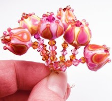
This set, which I am calling Opal Kiss, was made from the following colors - Precision Diamond Clear, ASK 104 Caramel Apple (for the metallic gold effect), CiM Heffalump and Pink Champagne, and Effetre Rosatto, Opal Yellow and Pale Topaz.
 I believe some of the darker effects came from the Caramel Apple reacting with some of the other colors. Caramel Apple is a very reactive color and reduces a pretty metallic gold. I think the dark lines appeared when it touched some of the darker transparent colors such as Pink Champagne.
Anyway - enough of the technical stuff - they just turned out pretty, and I am not sure I could duplicate the effect on some of them if I tried to. So, they're on auction!
Sunday, February 8, 2009
Colors Remind Me of People, Or
 People remind me of colors....
Often when I am working on choosing colors for a bead set, my brain is busy thinking about random stuff as well (multitasking?). Sometimes, a person comes to mind, and I end up picking colors that remind me of that person without even realizing it until later.
 In this case, it was my mom Karla, and this is the set that came out of the kiln this morning.
My mom is a beautiful person, with a classic and comfortable style - kind of like these colors. The sweet, earthy berries and effervescent limes remind me a lot of her personality.
 Mom's kind of complex, too - while on one hand she is familiar and warm, she is also bright and quietly cheerful, and I love her!
Karla's Garden beads were made from CiM glass in Heffalump, Dirty Martini, Simply Berry, Effetre glass in Grass Green, Olive, and Precision glass in Diamond Clear.
Even the glass names remind me of my mom! How weird is that? What colors remind you of your mom?
These beads are of course on auction - click them to see!
Saturday, February 7, 2009
Looks Like Fun!
Yep, more off-topic Entrecard stuff!
This contest looks like a lot of fun, and there sure are a ton of prizes and ways to enter.
Of course, it could be that I just dig the colors in their new banner. Seriously - cool!
Entrecard is great, come join in, and then enter the contest. :)

This contest looks like a lot of fun, and there sure are a ton of prizes and ways to enter.
Of course, it could be that I just dig the colors in their new banner. Seriously - cool!
Entrecard is great, come join in, and then enter the contest. :)
Subscribe to:
Posts (Atom)




 Posts


